01Introduction

Tonik

One receipt template for all transactions

Receipts are the last screen of every transaction in Tonik. I designed one receipt template for all six transaction types, used both right after a transaction and on the history page. I was the only designer, working with a UX writer and a PM. The head of design reviewed my work.

  • Payments
  • UX design
  • Information hierarchy
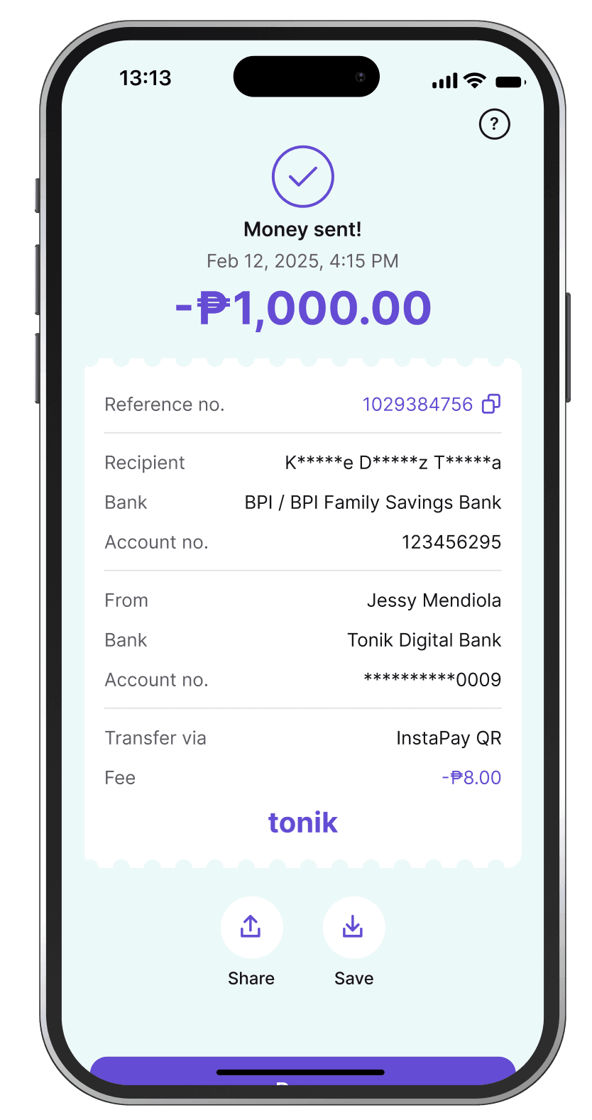
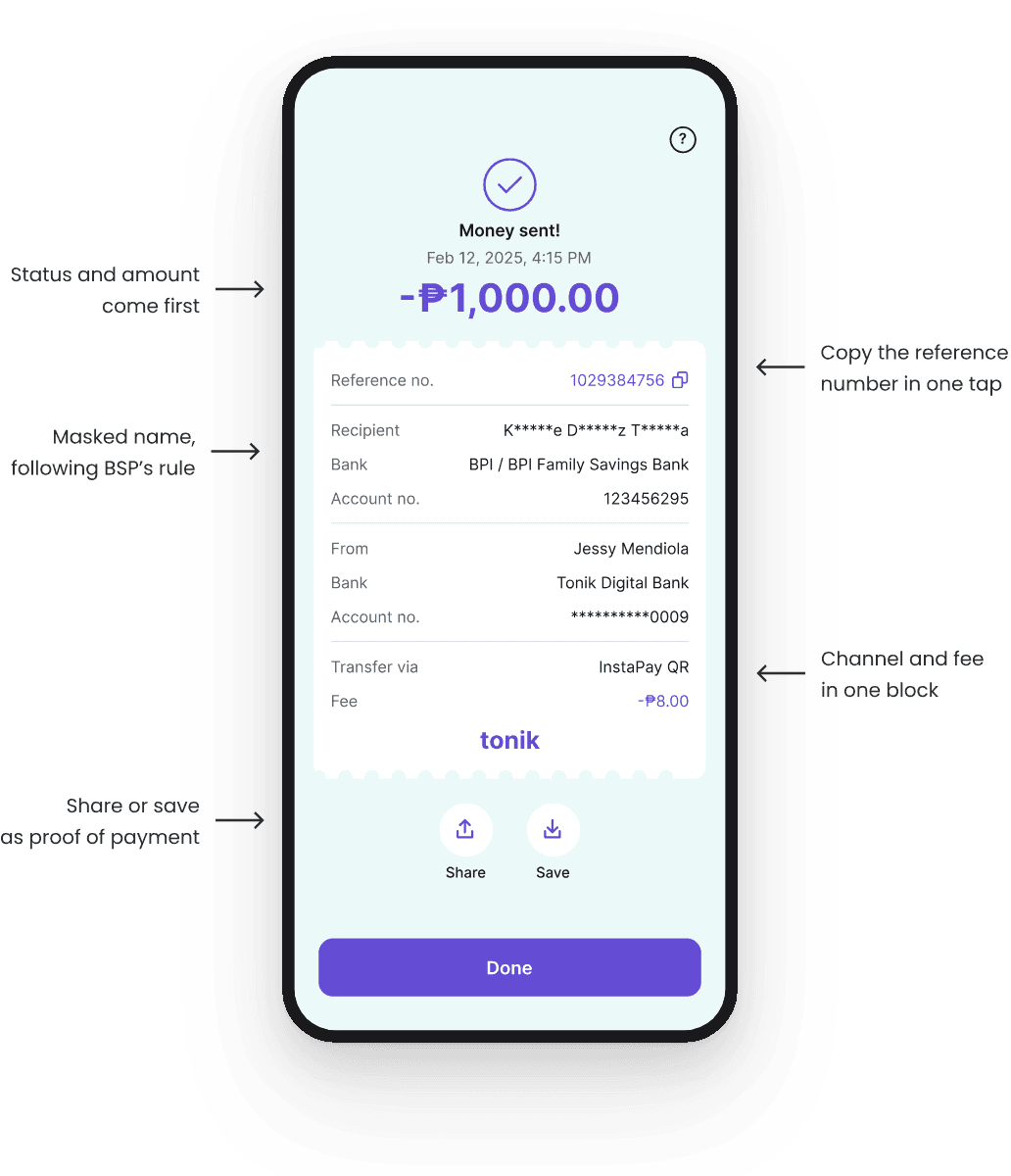
The new receipt in the Tonik app, "Money sent!", with the amount on top and the reference, recipient, sender, and channel with fee below

The problem

Tonik has six ways to send or pay money. They had 3 different endings, and the history page showed different details again. For a banking app, a receipt is proof of payment. Users send it to friends, merchants, and billers. If it looks different every time, it is harder to trust.

What users saw right after paying

Same action, 3 different endings.

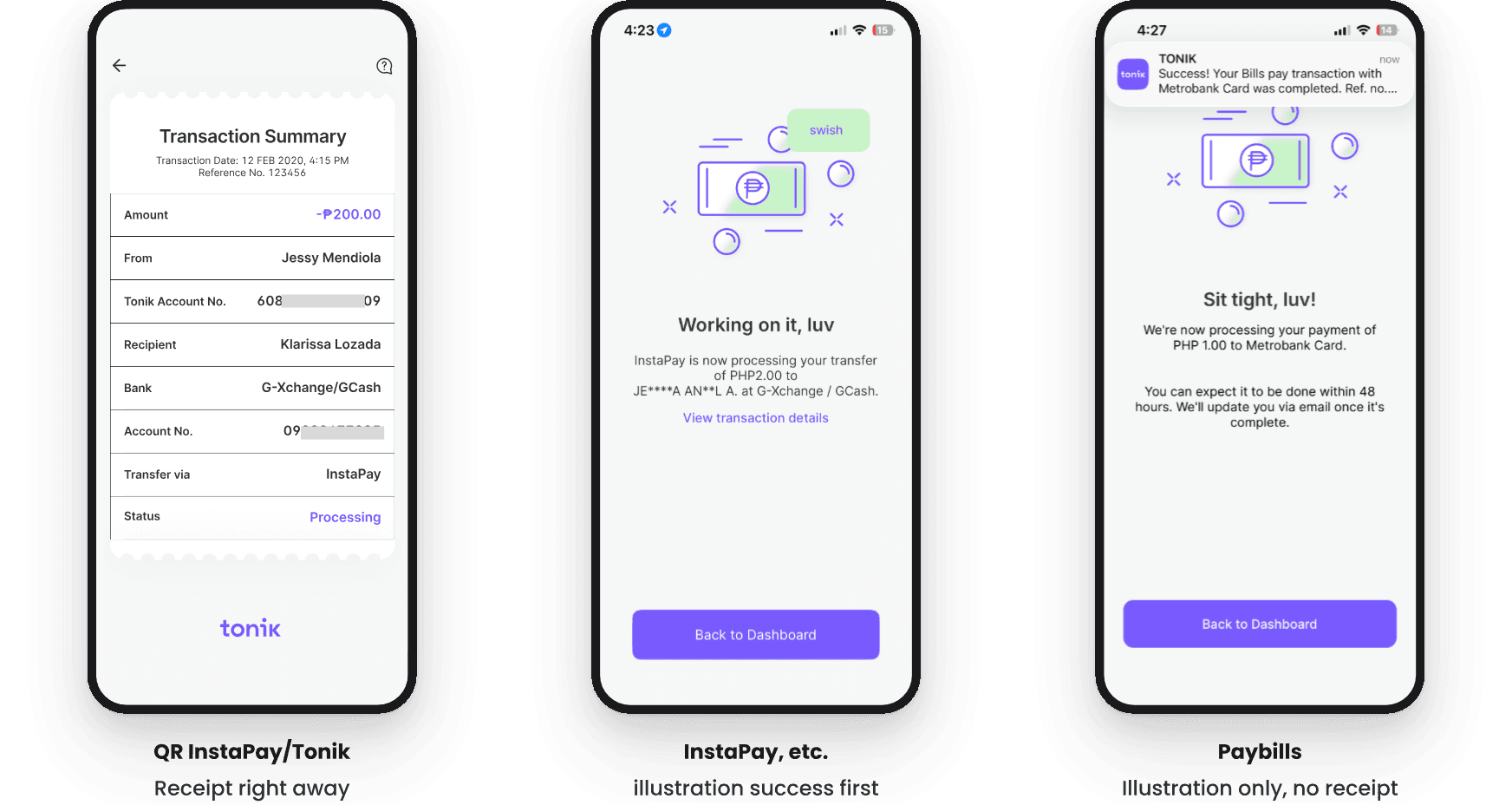
Old screens · right after the transaction

Three old screens. QR InstaPay/Tonik: a 'Transaction Summary' receipt right away. InstaPay, etc.: a 'Working on it, luv' illustration first. Paybills: a 'Sit tight, luv!' illustration only, with no receipt.
  1. Only the QR flows showed the receipt right away. They were added last, so they had the newest layout.

  2. InstaPay, PESONet, and Tonik to Tonik showed an illustration first. The receipt was one more tap away.

  3. Paybills showed a processing screen and nothing else. Users had no receipt to share.

The same transfer, two different screens

Users have two ways to see the transaction details: the receipt right after the transaction, and the transaction summary on the history page. But they show two different sets of information.

Old screens · InstaPay · transaction receipt vs history summary

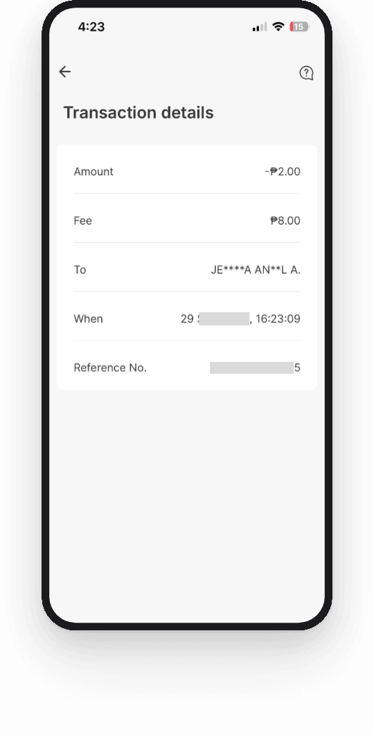
The old InstaPay receipt, 'Transaction details', with five rows: amount, fee, to, when, and reference number.

Receipt, right after transaction

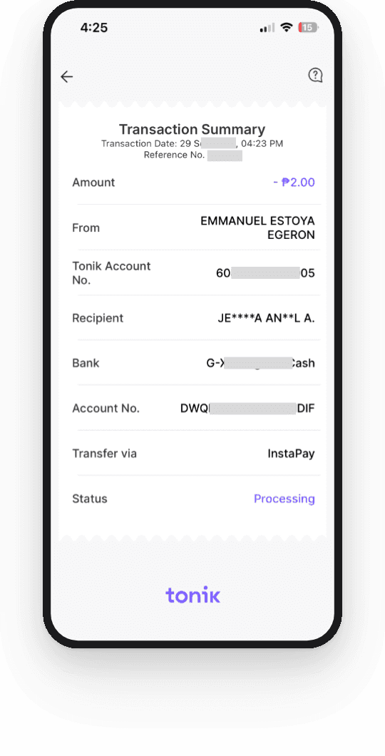
The old InstaPay history page, 'Transaction Summary', with eight rows in a receipt-style card, including bank, transfer channel, and status.

Transaction details in history

Differences between “Receipt, right after transaction” and “Transaction details in history”
What differsReceipt, right after transactionTransaction details in history
Title“Transaction details”“Transaction Summary”
Rows5 rows8 rows
Only on this screenFeeBank, channel, status
LayoutPlain cardReceipt-style card
Neither screen had everything.

Why it happened

The design was not intended. Tonik added payment channels one at a time over the years, and each one kept the layout it launched with.

How the receipts grew apart

Channels added since 2020
  1. InstaPay, PESONet, Tonik to Tonik (2020)Illustrated screen, then the receiptReceipt is one step away
  2. Paybills (2021)Processing screen onlyNo receipt to share
  3. QR InstaPay, QR Tonik to Tonik (2024)Newest layout, but built on the history pageReceipt and history do not match
3 different endings
QR was added last, so it had the most modern layout.

The team later saw that users need to see the receipt right away. But there was no time to update the older flows, so the differences stayed and became tech debt.

Changing the scope

The PM started this project to make the QR receipt and the QR history page consistent. I pushed for more. Fixing only QR would give us a seventh version.

So I proposed one receipt template for every transaction type.

Screens in scope

Screens in scope
Right after transactionHistory page
QR InstaPayNew templateUnchangedNew templateUnchanged
QR Tonik to TonikNew templateUnchangedNew templateUnchanged
InstaPayNew templateUnchangedNew templateUnchanged
PESONetNew templateUnchangedNew templateUnchanged
Tonik to TonikNew templateUnchangedNew templateUnchanged
PaybillsNew templateUnchangedNew templateUnchanged
One template fixes the old tech debt, and new payment channels can use it later.

Mapping the information

I listed every field that each transaction type showed. Then I ranked them by what users need first:

  1. Status

    Did it work?

  2. Amount

    How much?

  3. Reference number

    What do I need if something goes wrong?

  4. Recipient

    Who received it?

  5. Sender

    Which account did it come from?

  6. Channel and fee

    How was it sent, and did it cost anything?

Then I grouped the fields into four blocks, so every receipt has the same shape even when the details change.

I owned the structure and hierarchy. The UX writer wrote the labels.

The template

Every receipt uses the same four blocks in the same order: reference, recipient, sender, and channel with fee.

The final receipt

Receipt template

The new receipt with notes: status and amount come first, masked name following BSP’s rule, copy the reference number in one tap, channel and fee in one block, share or save as proof of payment.
  1. The amount is the biggest element, so users can check it at a glance.

  2. The reference number has a copy button. Users paste it in chats and support tickets.

  3. Names and account numbers are masked, following a new privacy rule from BSP.

  4. Share and Save sit right below the receipt, because users send it as proof of payment.

All cases, one template

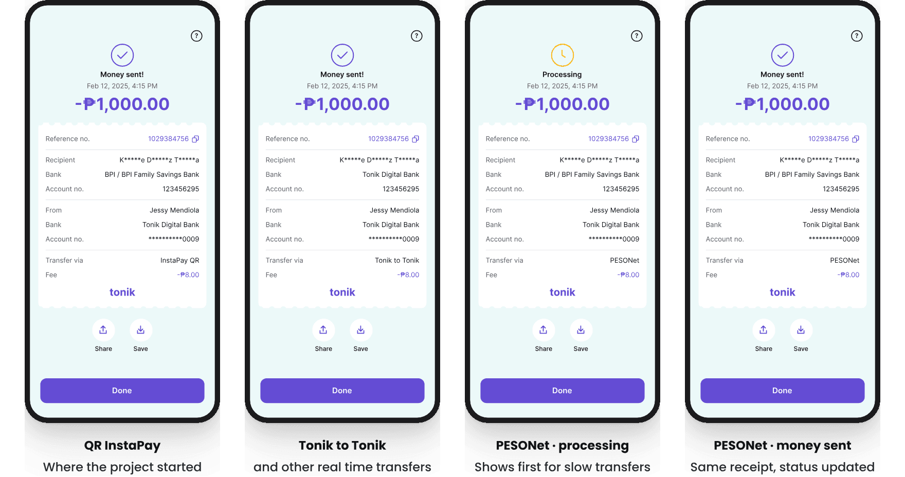
The layout stays the same. Only the status and the transaction details change. Users also see the same receipt on the history page.

Receipt variants

Four receipts with the same layout. QR InstaPay, where the project started. Tonik to Tonik and other real time transfers. PESONet processing, which shows first for slow transfers. PESONet money sent: same receipt, status updated.
  1. QR InstaPay, where the project started, looks the same as every other transaction type.

  2. Tonik to Tonik (and QR Tonik to Tonik) and InstaPay transfers adhere to a consistent design template.

  3. Slow transfers like PESONet and Paybills show “Processing” first.

  4. The status changes to “Money sent!” when the transfer is complete.

What I learned

What the design did well

  • One template covers all six transaction types.
  • The history page uses the same layout, so users see the same details after paying and later.
  • New payment channels can use the template without a new design.

What I would do next

I’d measure:

  • Compare related support tickets from before and after the redesign
  • Do more users share or save their receipts?

Next time:

  • I will push for a scalable pattern early, before the differences become expensive to fix.