Simply Wall St
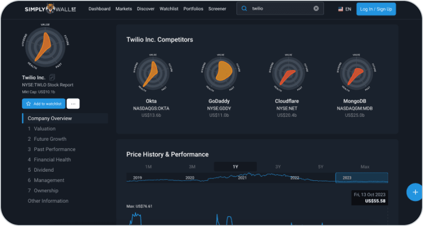
Uses a side navigation that highlights the section you are viewing. This matched the amount of content in our dashboard, so we used this approach.
01Introduction

Inquiro helps advertisers understand their audience using data. One of our enterprise clients found the dashboard hard to navigate, so I redesigned it to help them find their data more easily, choose which charts to see, and export the data for their own reports. I was the only designer.
One of our enterprise clients told us the dashboard was hard to navigate. They had trouble finding the data they needed.
They also asked for a way to export the dashboard, so they could use the charts in presentations to their own stakeholders.
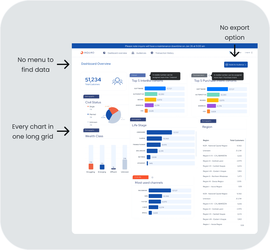
When I reviewed the old dashboard, I found the reasons behind the feedback.
Old dashboard
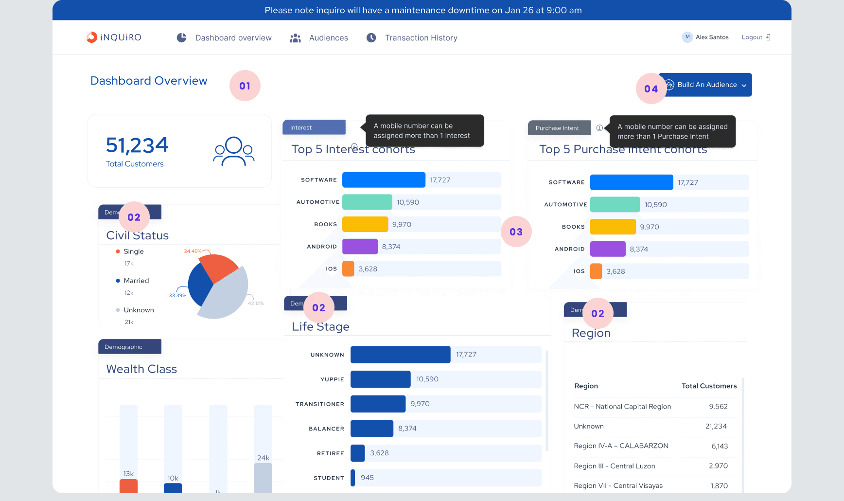
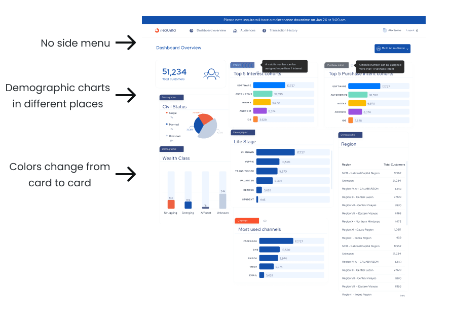
No navigation. All charts sat in one long grid, so users had to scroll and scan the whole page to find one chart.
Related data was scattered. Civil Status, Wealth Class, Life Stage and Region are all demographic data, but they sat in different places.
Charts did not look consistent. Some used one color, and others used a new color for every bar, even when the colors had no meaning.
No export. Clients had to take screenshots to use our data in their reports.
It could not grow. Every new chart made the grid longer and messier.
The PM, the client relations team and I worked together to understand the clients’ needs. We worked closely with a small group of enterprise clients, so we could talk to them directly instead of running large studies.
I also looked at how other products show a lot of data on one screen.
Uses a side navigation that highlights the section you are viewing. This matched the amount of content in our dashboard, so we used this approach.
Uses a sidebar with a separate page for each type of content. This could work for us later, when the dashboard grows.
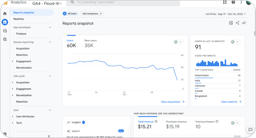
We were a startup, so we needed something good that we could also build quickly. The side navigation gave us the best balance.
I ran a session with the PM, some developers and the data team. We agreed on four things to solve.

A new layout for the dashboard

Letting users choose which charts to show

Better chart visualizations

An export function
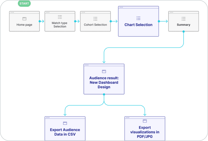
After this, I made the user flow and paper wireframes to review the ideas with the team before moving to UI.
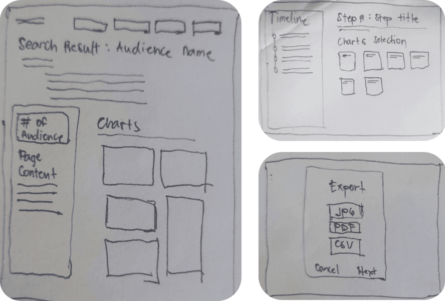
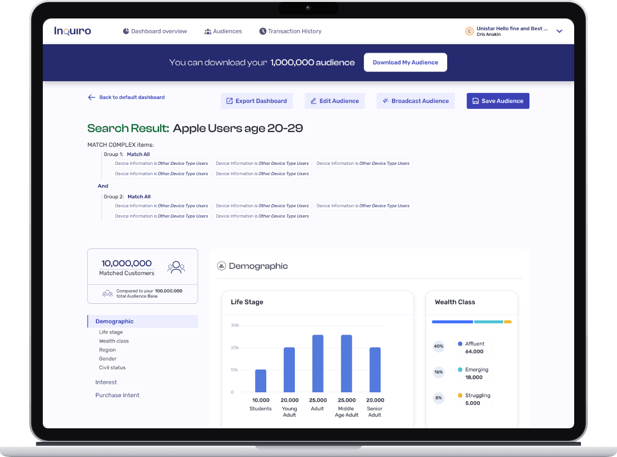
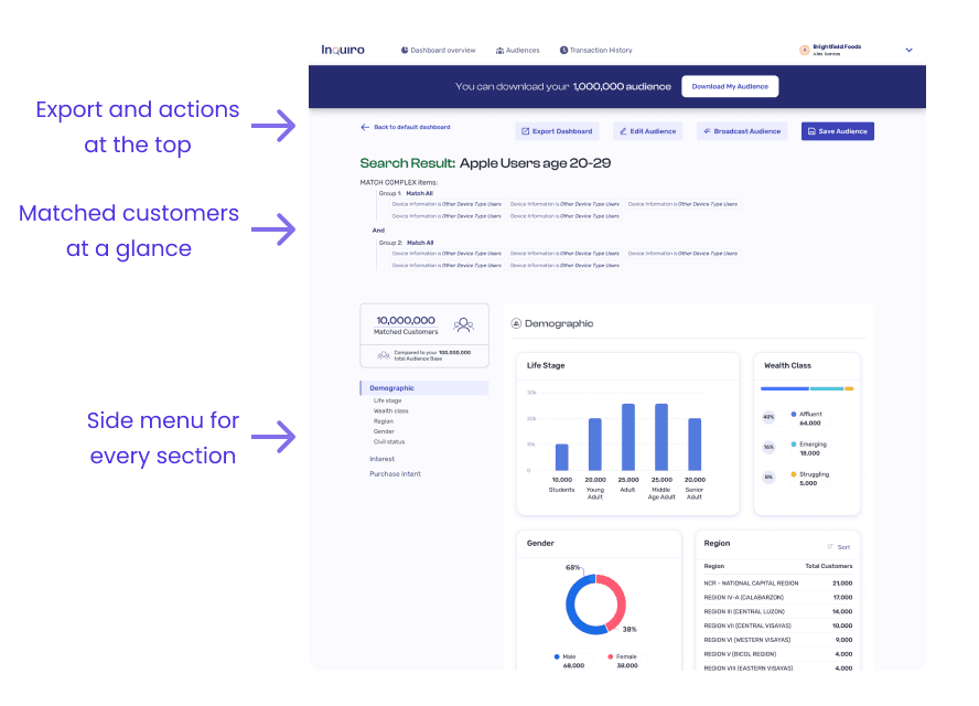
The new layout shows all dashboard sections in a side menu. Users can see the full content of the dashboard at a glance and jump straight to the data they need. Related charts now sit together in one section, and new charts can be added to the menu without making the page harder to use.
Before
After
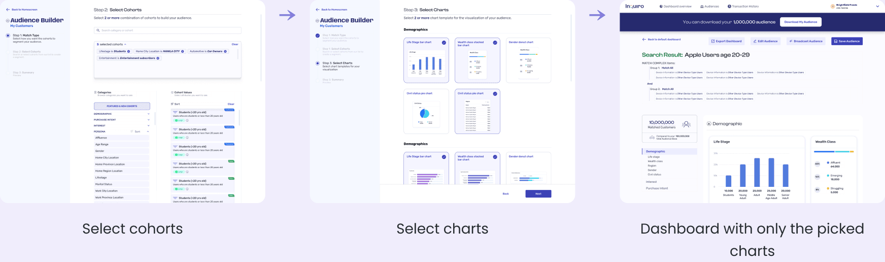
Users can now select only the charts they need, instead of seeing all available charts. They can still change which charts are shown after creating the dashboard.
New flow
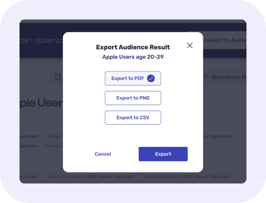
Users can export the dashboard as a PDF or PNG for their presentations. They can also export the data as a CSV file so they can make their own charts.
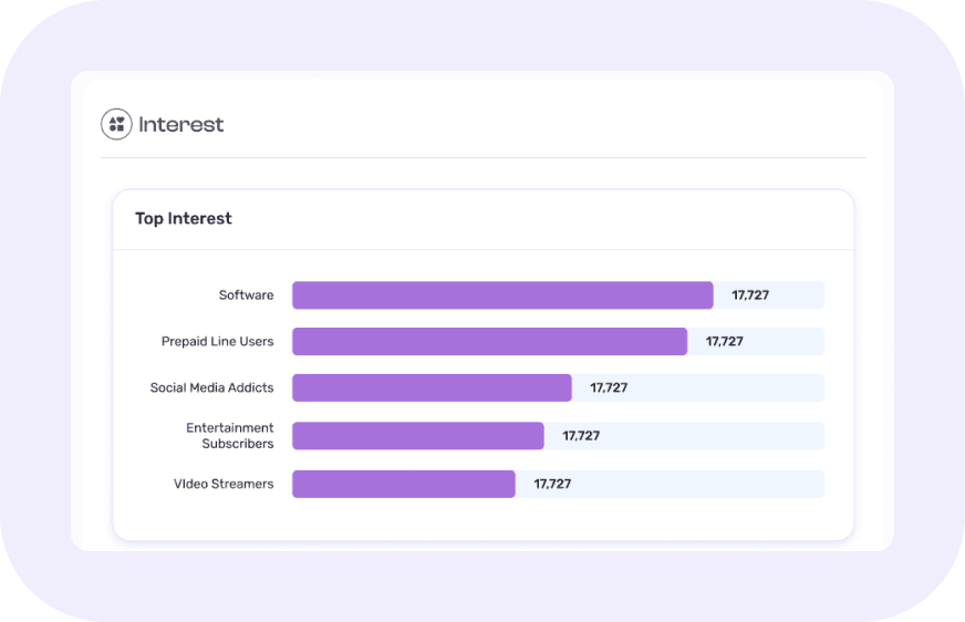
I worked with the data team to redesign the charts, so the data is easier to read. Each section now uses one color, so users do not have to guess what each color means.
The redesign was shipped and used by our enterprise clients. We did not track metrics because our user base was small. Instead, we kept in close contact with our clients and asked them directly.
Can clients find the data they need?
Yes. They told us they could now find and understand their data more easily.
Which feature did they value most?
Export. They could use our data directly in their own reports.
