Designing a counter offer feature for loan customers
Counter Offer lets Tonik offer a different loan amount or terms, instead of only approving or rejecting. I was the only designer, working with a UX writer. The head of design reviewed my work.
Loans
UX design
Flow mapping
02
The problem
Once customers applied for a loan, they either got the exact amount they applied for or got rejected. There was no flexibility in approving loans.
This missed two groups:
Customers who qualified for less got nothing.
Customers who qualified for more only got what they asked for.
03
What made it complex
With the counter offer feature, Tonik can now offer a lower amount to partially qualified customers and a higher amount to overqualified customers. Risk, credit, and product set the rules:
What Tonik offers at each qualification level
Qualification level
Commercial response
Unqualified
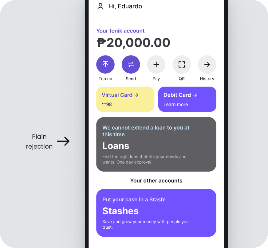
Plain rejectionClose the path clearly.
Partially qualified
Offer a lower amount or same amount with new term or rateKeep terms viable while reducing exposure.
Qualified
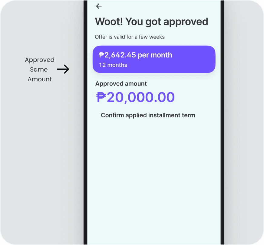
Same amount, term, and ratePresent the same approved offer.
Overqualified
Offer a higher amountInvite an upgrade without creating pressure.
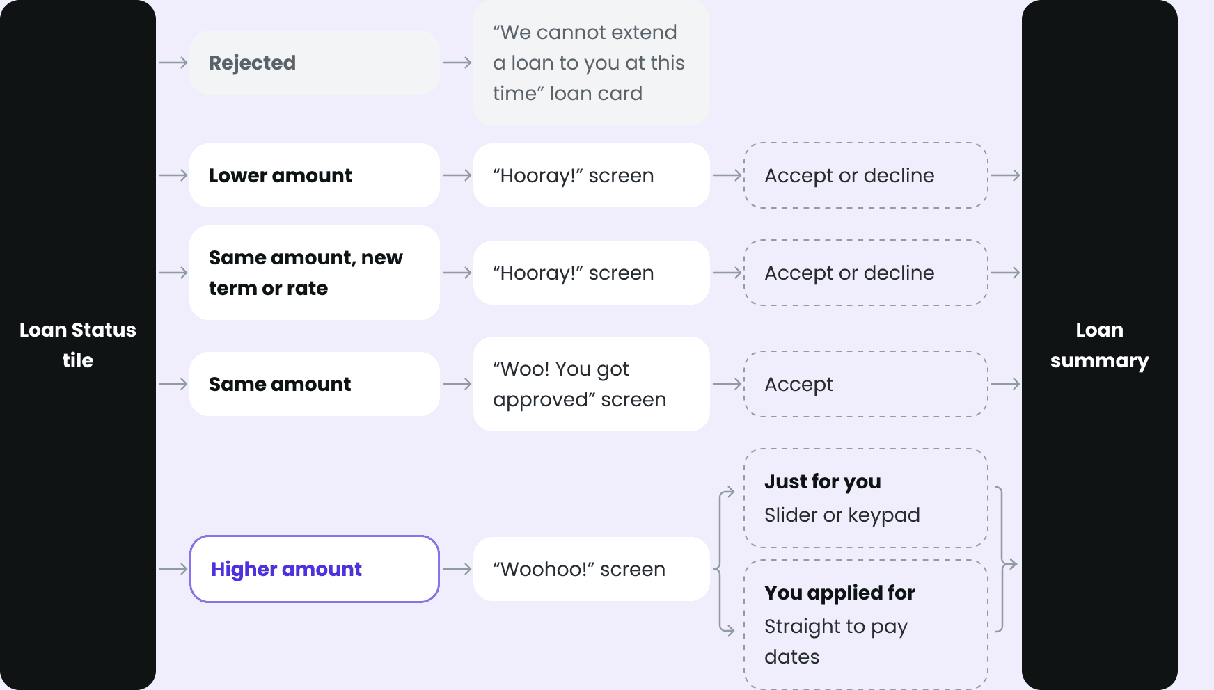
With the PayHinga choice carried over from the application, that is about 10 paths.
Offer paths
Each path has a version with and without PayHinga.
I mapped every path before designing screens.
04
Designing the offer screens
The offer screens reuse the loan calculator from the application, so customers can compare the offer with what they asked for. The UX writer wrote the copy.
The lower and same amount (new term or rate) offers
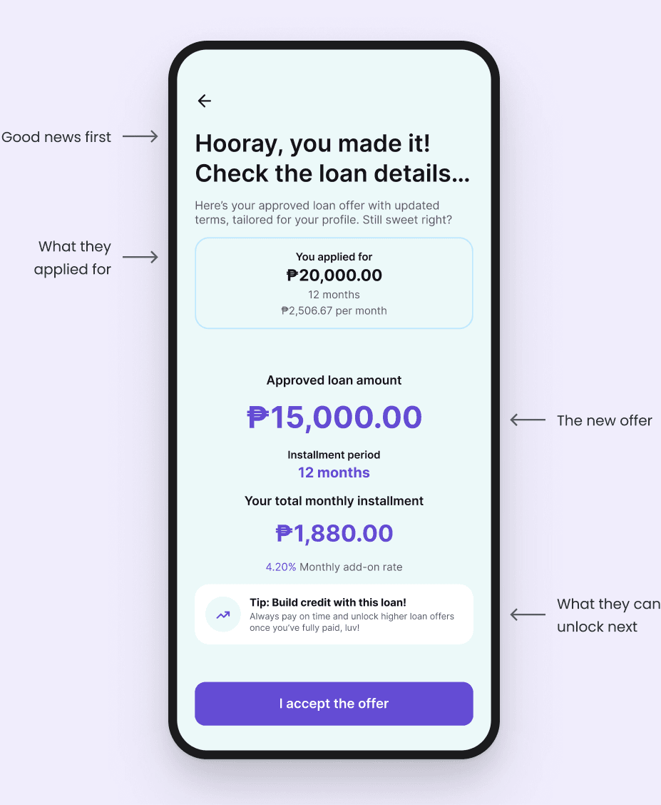
Lower amount offers and same amount offers (new term or rate) use one layout. Only the amount, term, and monthly payment change.
The lower and same amount (new term or rate) offers
01
The headline leads with good news. It is still a loan they can take.
02
“Tailored for your profile” explains the change without revealing the scoring.
03
Showing what they applied for makes the change easy to see.
04
The tip tells them that paying on time can unlock higher loan offers.
The higher offer
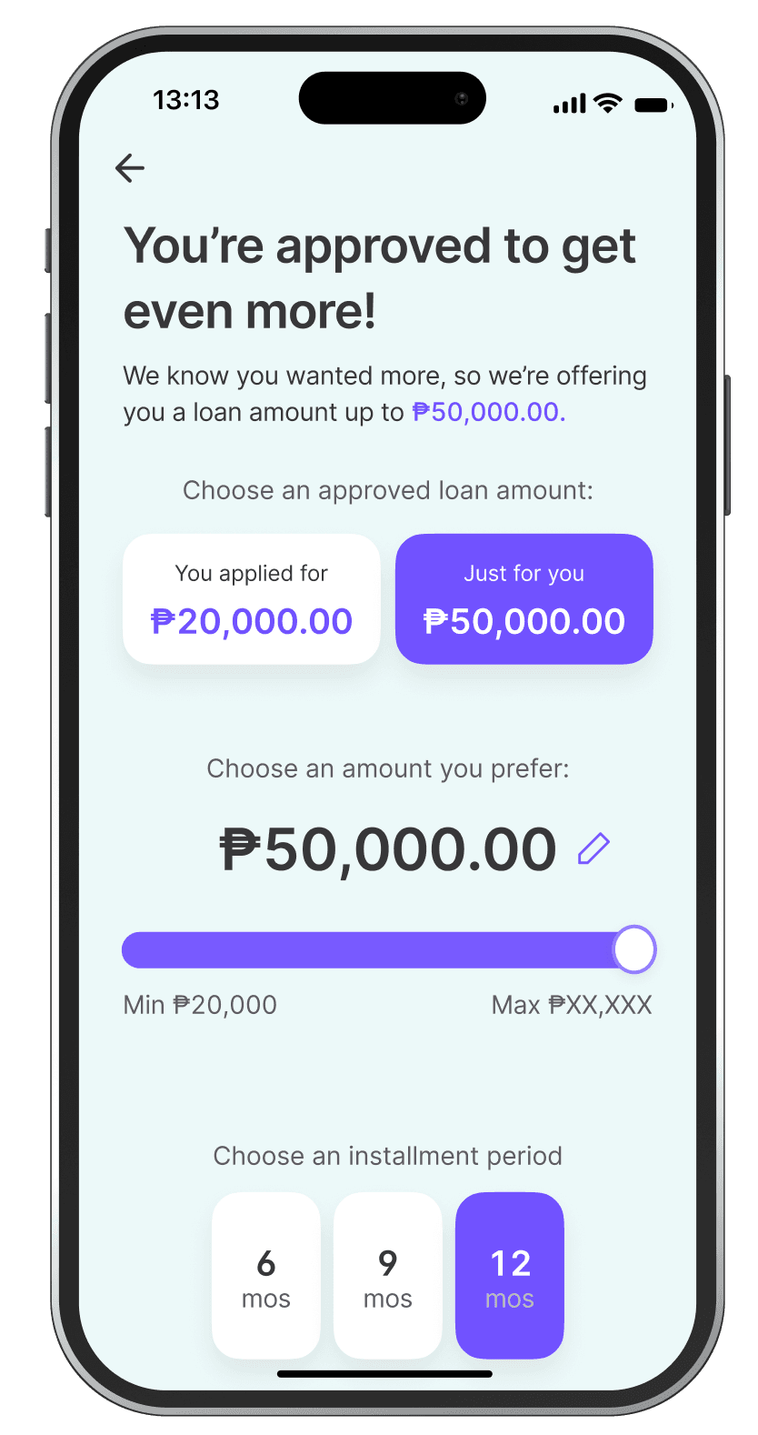
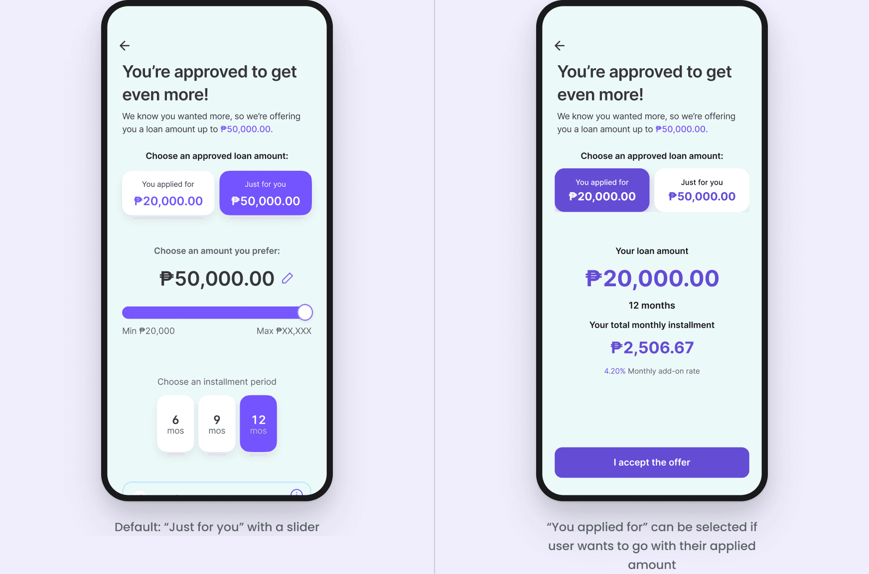
Two cards let customers choose between the higher offer and what they applied for.
Higher offer
05
Decision and trade-off
The business wanted to show only the higher amount, in a large size.
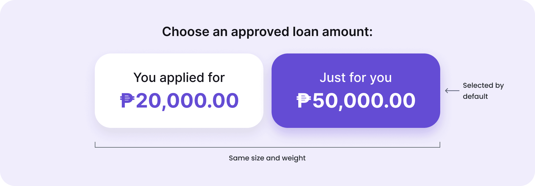
I pushed back. Many customers would still want what they applied for, and might miss it or borrow more than they need. So I made both amounts equal cards.
We agreed to select “Just for you” by default.
06
What I learned
What the design did well
One layout for lower and same amount offers meant fewer screens to build.
A lower offer can feel like progress instead of rejection.
What I would do next
I would test:
Do customers notice they can keep their applied amount?
Does the default push them to borrow more than they need?