01Introduction

Tonik

Making add-ons seen & understood

PayHinga is Tonik's loan add-on. The screen was designed to push customers toward it, but they still skipped it. So I tested it to find out why, then redesigned how it was presented. I was the only designer, working with a UX writer. The head of design reviewed my work.

  • Loans
  • UX research
  • UX design
  • Product marketing
  • Business
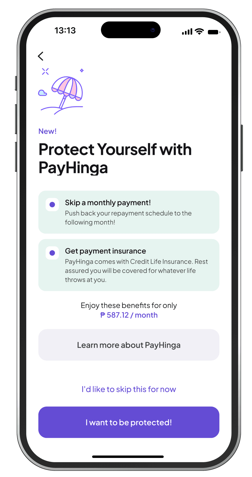
The new PayHinga screen in the Tonik app, with two short benefit cards and the price under them

The problem

The loan business team wanted more customers to take the PayHinga add-on. The old flow already pushed customers hard toward it, but they still did not take it.

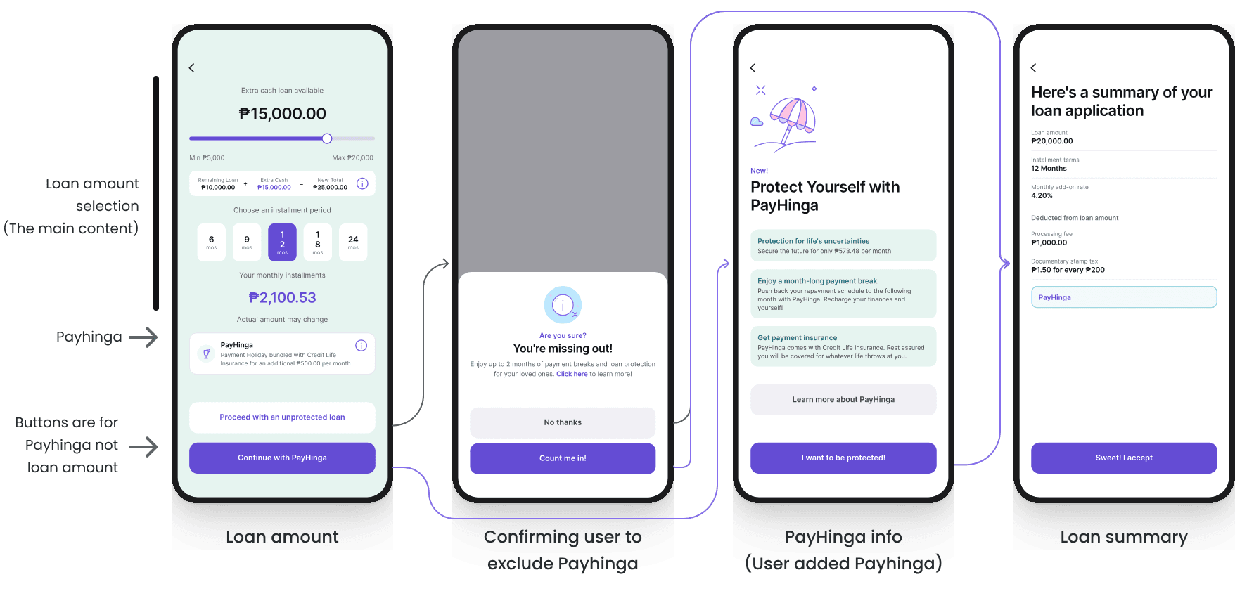
Old flow

The old flow in four screens: loan amount with PayHinga at the bottom, a pop-up asking 'Are you sure?' when skipping it, the PayHinga info screen, and the loan summary.
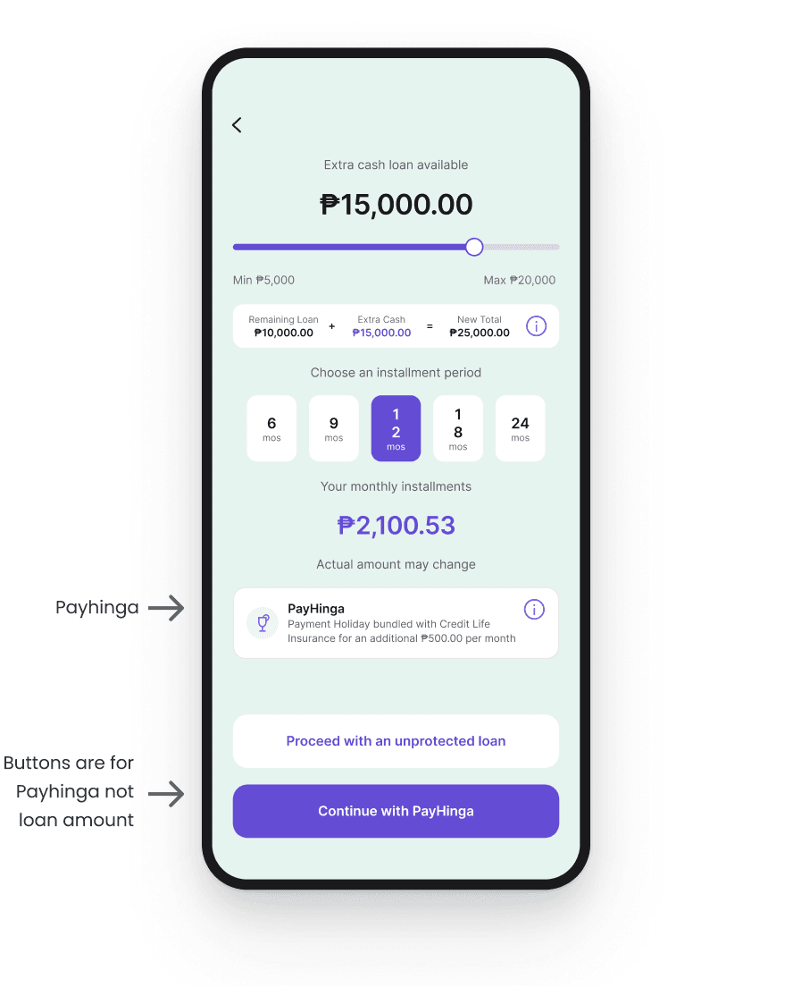
  1. The screen is overwhelming. Amount, loan breakdown, terms and monthly payment all come before PayHinga.

  2. The decision sits on the two main buttons, so customers move forward without noticing what they chose.

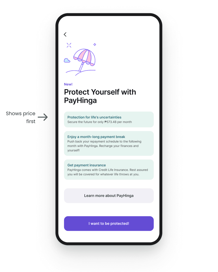
  3. On the info screen, the price sits inside the first benefit card, before customers know what they are paying for.

User research & testing

The UX writer and I tested the old design with 8 people. We wanted to learn 5 things.

  1. Do customers notice PayHinga?

    Some saw it but chose to ignore it. Some who did not see it tapped the opt-in button, thinking it was for the loan itself.

  2. Do they understand what it is and what it gives them?

    Almost nobody did.

  3. How do the layout, copy and interaction affect the decision?

    The loan amount screen is already full. Customers are focused on the amount, so PayHinga never gets their attention.

  4. Is it worth the price to them?

    Based on what they understood from the screen, no.

  5. Do they see themselves as someone who needs protection?

    Customers with families and more responsibilities tended to say yes. Younger customers said no.

There were two problems. People did not understand it, and even those who did understand it did not want it.

Design exploration

The old screen asked two questions at the same time: how much do you want to borrow, and do you want protection? I separated them into two pages, so the customer only answers one question at a time.

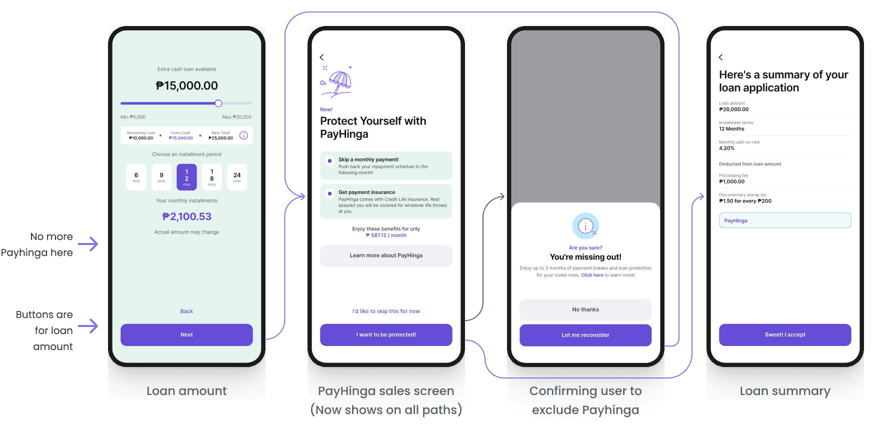
New flow

The new flow in four screens: loan amount without PayHinga, the PayHinga sales screen, a pop-up confirming the customer wants to skip it, and the loan summary.
The new flow. PayHinga gets its own screen between the loan amount and the summary.

The loan amount screen

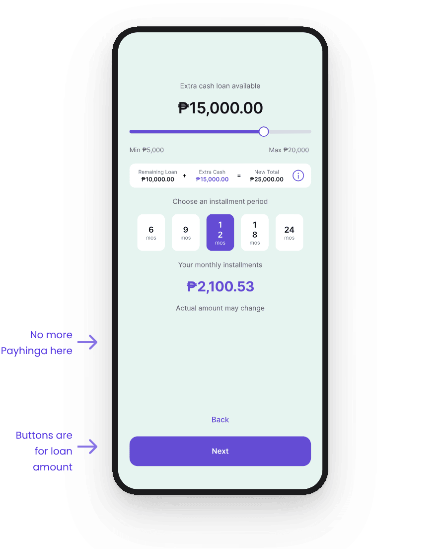
I took PayHinga off this screen. The buttons are now only Back and Next, so the screen asks one question. The screen also has less content now.

Before

Old loan amount screen with the PayHinga tile at the bottom and two buttons about PayHinga.
Two questions on one screen, but both main buttons are about PayHinga.

After

New loan amount screen without PayHinga, with only Back and Next buttons.
One question on this screen, and buttons that only move the customer forward or back.

The PayHinga screen

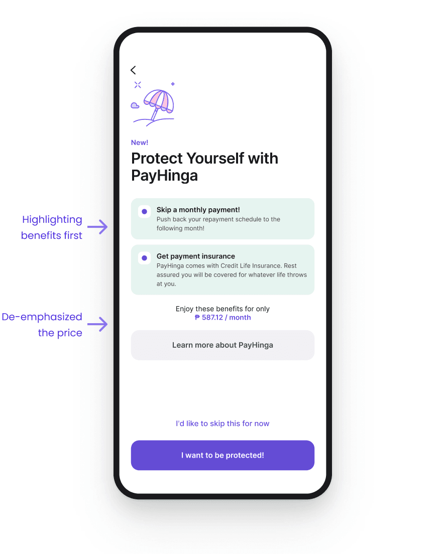
The PayHinga information screen now shows in the main flow, instead of only when customers opted in. The benefits come first and stay short, so people read them instead of skipping long text. The UX writer wrote the copy. I put the price under the benefits, without emphasis. If people saw the price first, they might not read the benefits at all.

Skipping still takes only a tap and a confirmation. Our testing showed that people who did not want PayHinga would skip it anyway, so we did not want to make skipping hard.

Before

Old PayHinga screen with three long cards and the price inside the first card.
Three long cards, and the price hidden inside the first one before anyone knows what it buys.

After

New PayHinga screen with two short benefit cards first and the price under them.
Customers see and understand the benefits before the price.

Validating the design

We ran a second round of testing with new people to avoid bias. Three things got better, and two did not change.

Second round of testing: results before and after the redesign
CriterionBeforeAfterResult
VisibilitySeen but ignored. Some tapped opt-in by mistakeCustomers now clearly see PayHingaFixed
ComprehensionAlmost nobody understood it or its benefitsMost understand what it is and what it gives themFixed
Influence of the designOverwhelmed by the loan amount screen, focused only on the amountWith its own page, customers can focus and decide more calmlyFixed
Perceived valueNot worth the priceStill not worth the priceNo change
Risk perceptionDepends on life stageSame. Customers with families and more responsibilities tend to say yesNo change

What I learned

What the design fixed

  • Let people focus on one thing at a time. Then they may pay attention to the other things you want them to see.
  • That part was a presentation problem, so design could fix it.

What it could not fix

  • Even the customers who understood PayHinga did not think it was worth the price.
  • Layout and copy changes could not fix that.

What I would do next

I would:

  • Look at segments instead of the whole base.
  • Start with customers with families and more responsibilities. In the research, they tended to see themselves as needing protection.
  • Explore with the business how PayHinga can do more for those customers, to make the add-on worth it for them.