Protanopia (red-blind)
01Introduction

Footfall Analysis shows how many people visit a location, and how often, over time. Mall advertising managers use it to set their ad prices and advise their advertisers. I designed the flow to create the report and the dashboard that shows the results. I was the only designer.
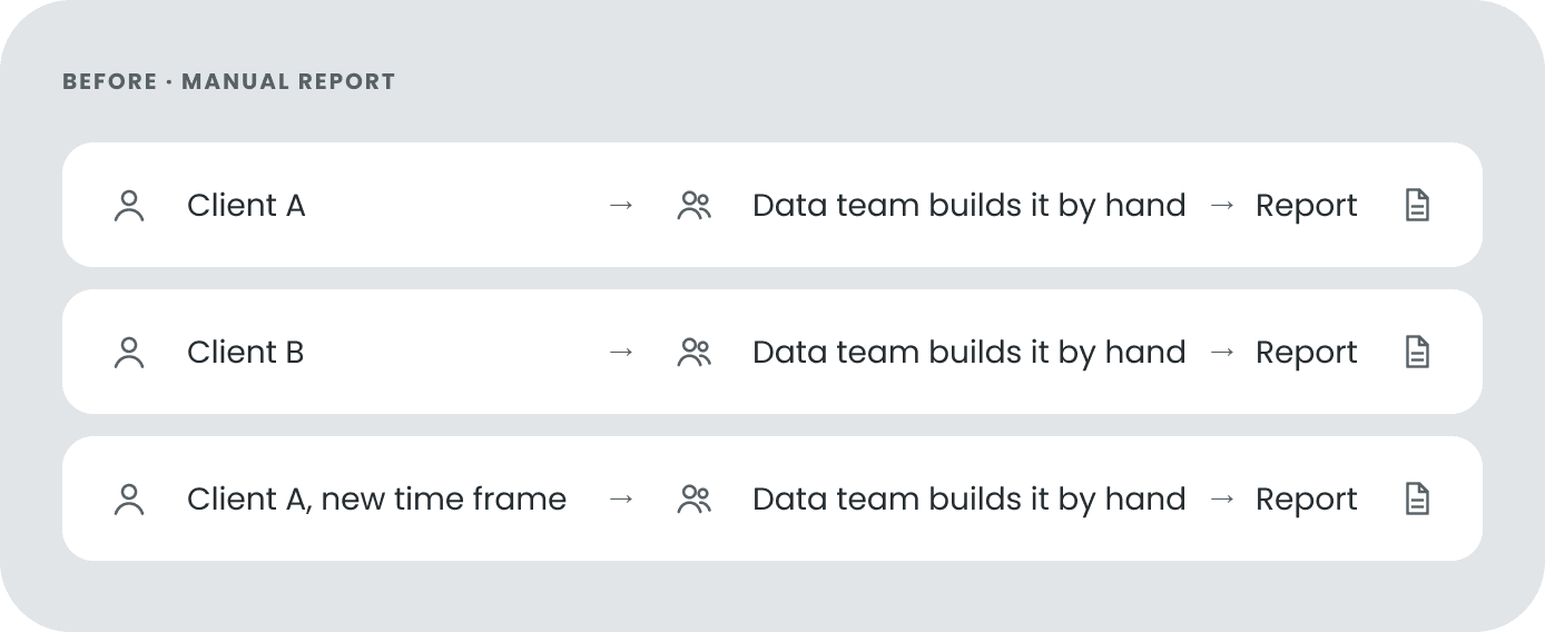
One of our clients wanted new ways to use our data. The data team made a Footfall report for them by hand, and the client liked it.
But a manual report does not scale. Every new request needed the data team’s time. Inquiro decided to turn it into a feature in our platform, so clients could create the report themselves.
User story
“As an advertising manager, I want to see visitor traffic in the mall at different times, so I can set ad prices based on data and give better advice to advertisers.”
With this user in mind, I looked at what clients already knew. They already used the Audience Builder, so I reused its step-by-step flow and its dashboard layout. Clients did not have to learn a new tool, and developers could reuse the components.
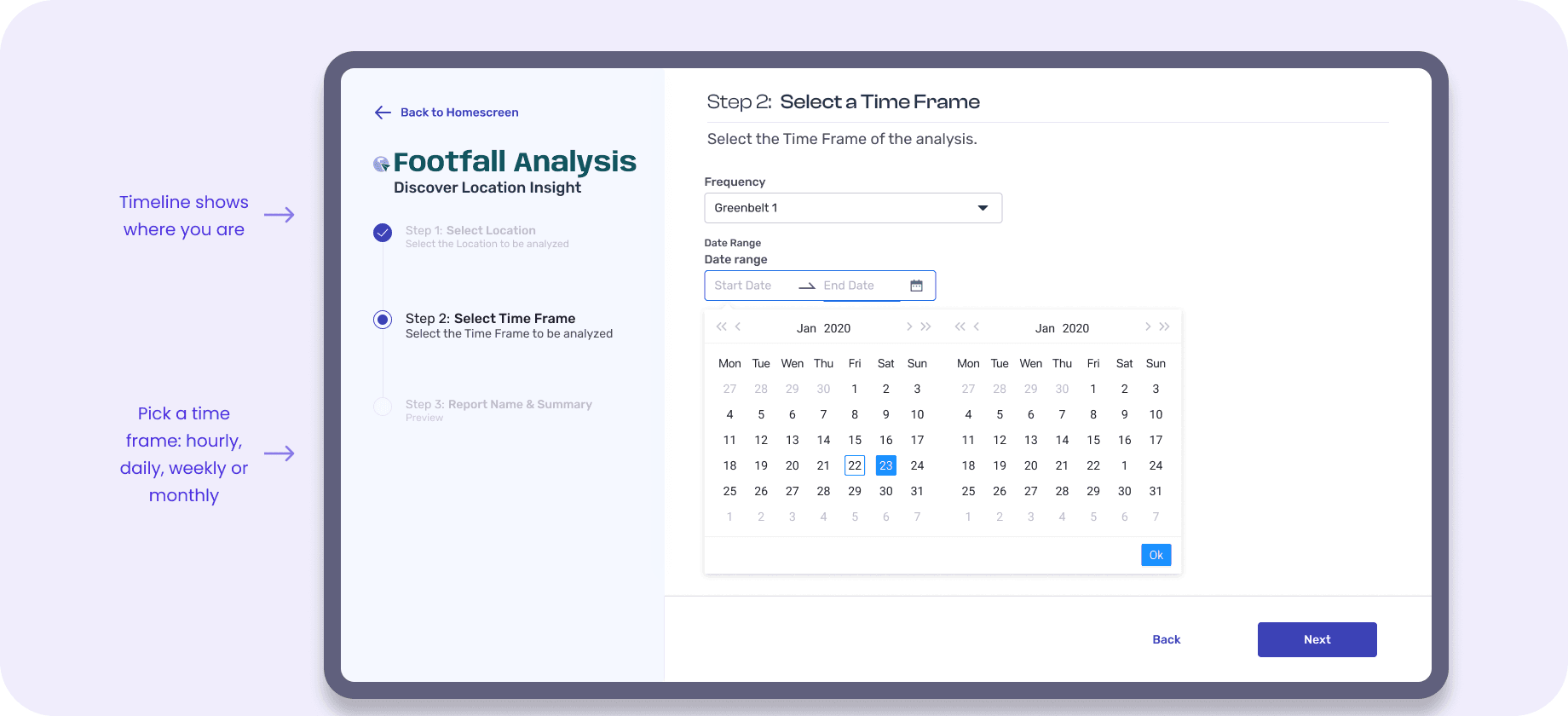
Step-by-step flow with a timeline, from the Audience Builder.
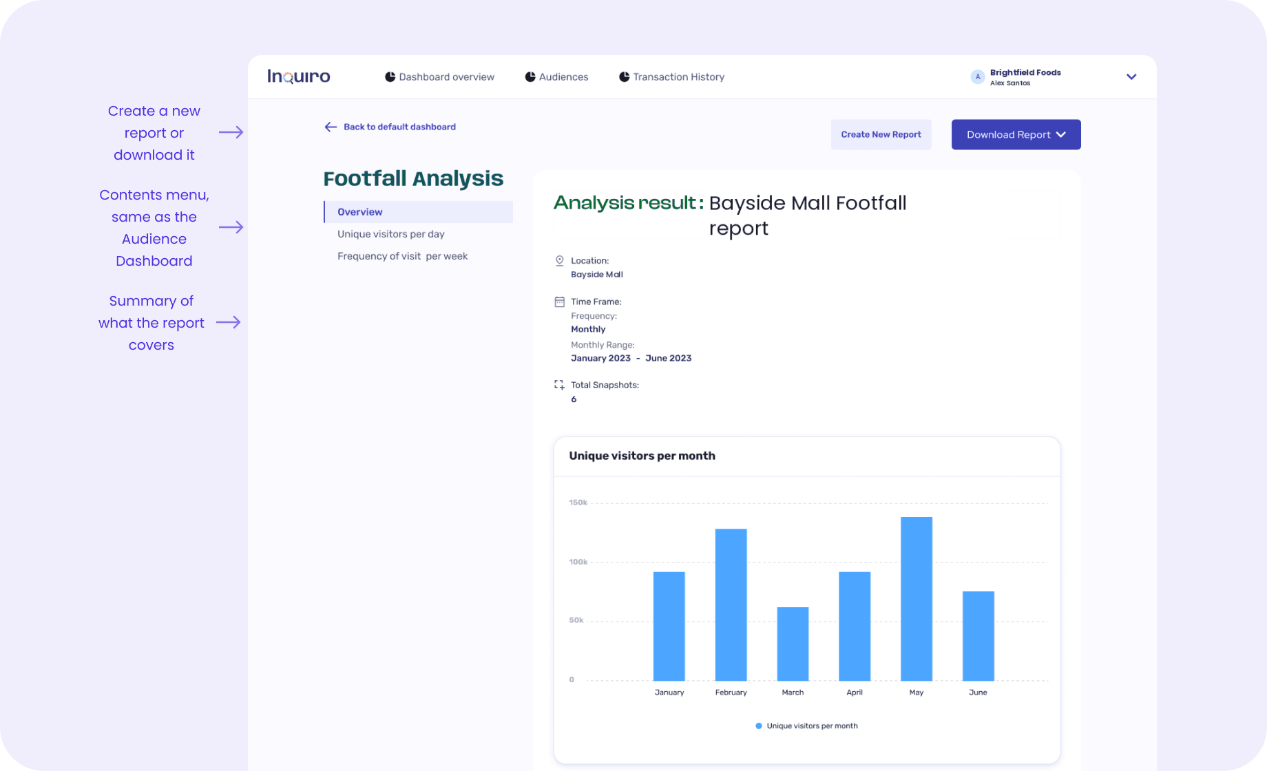
Dashboard with a contents menu, from the Audience Dashboard.
Download as PDF, JPG or CSV, from the same export.
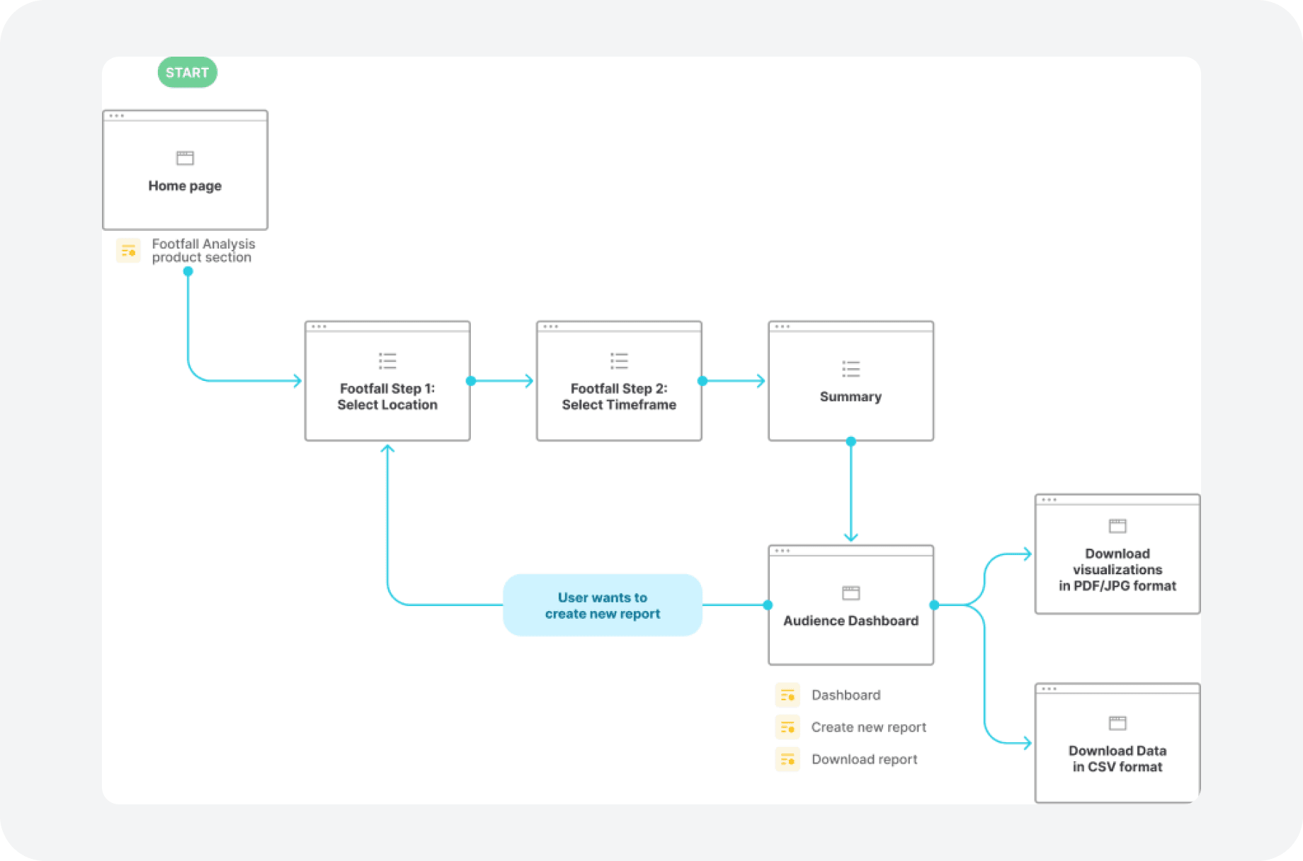
A timeline on the left shows the current step and the next steps. We planned to add more options to Footfall later, so the timeline needed room for more steps. Clients wanted to see their data by hour, day, week and month, so the time frame step supports all four.
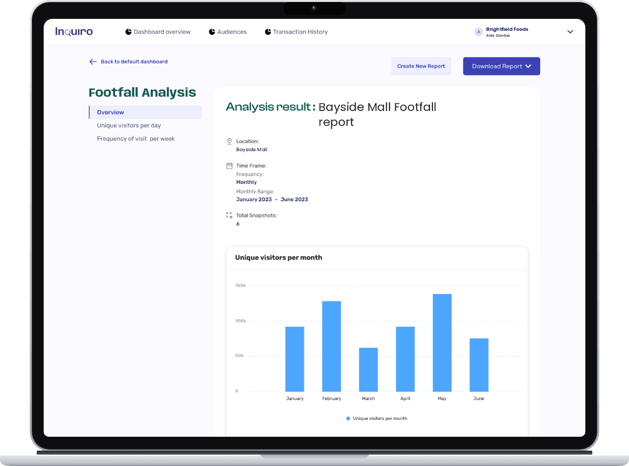
The dashboard uses the same layout as the Audience Dashboard, with a contents menu on the left. The top shows a summary of the report: location, time frame and number of snapshots.
Complex design decision
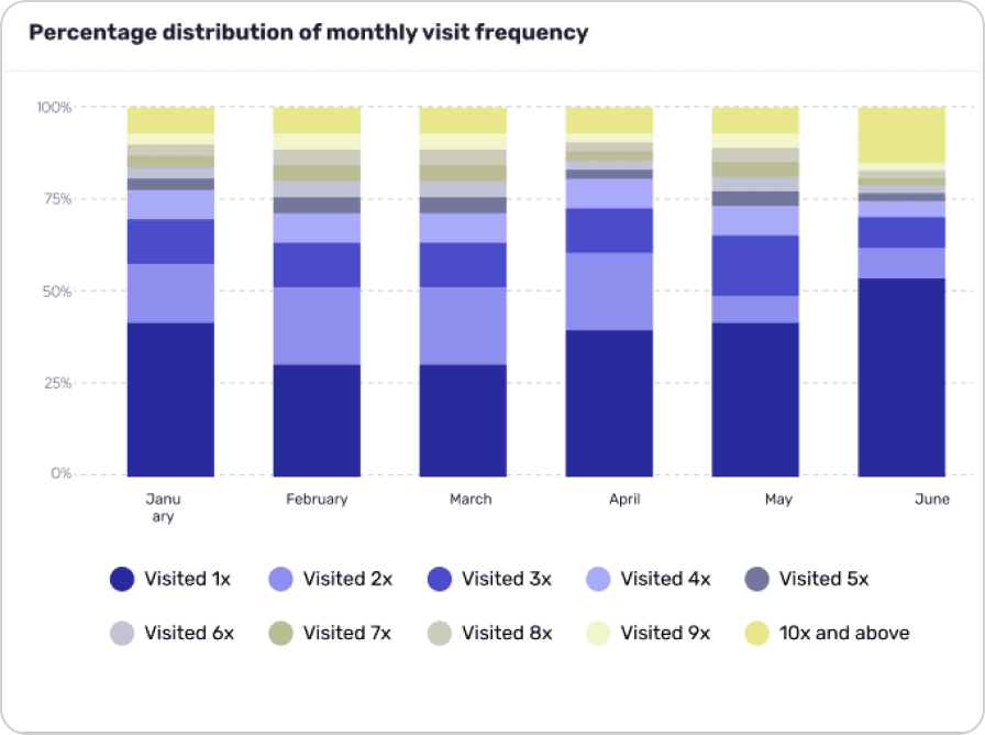
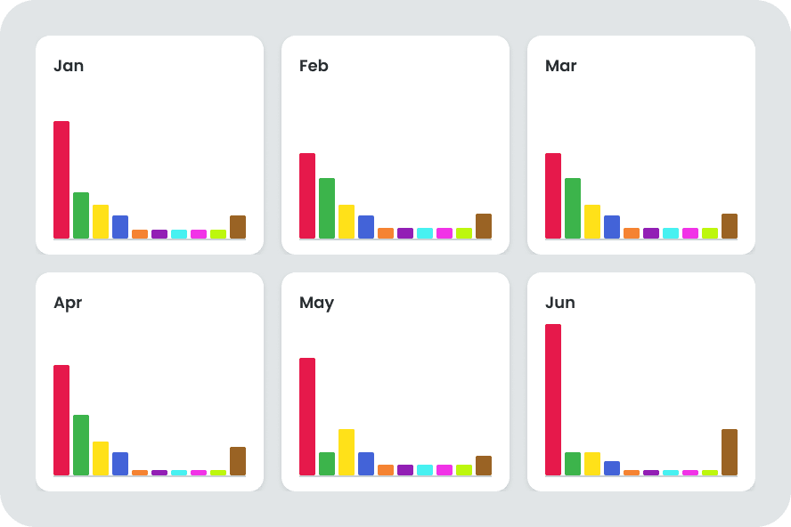
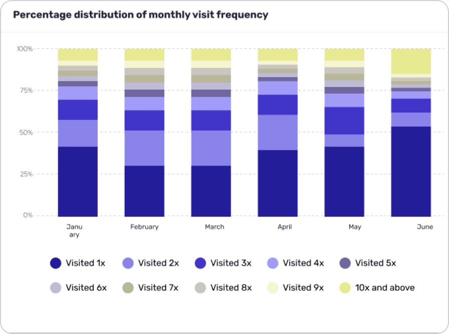
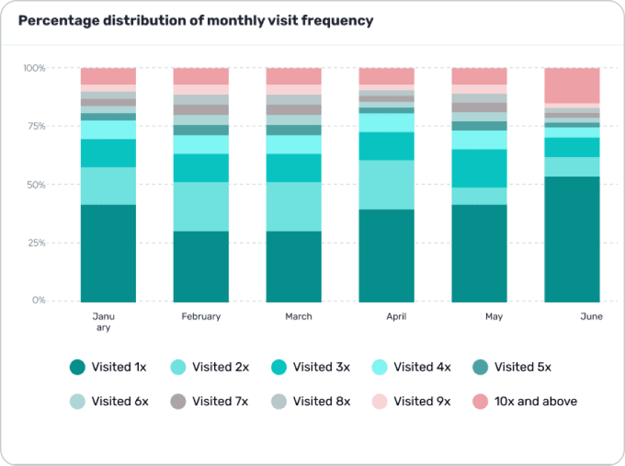
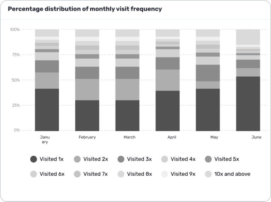
One of the hardest charts to design was visit frequency: it shows how many people visited once, twice, and so on, each month. I combined the data from 6 charts into one, so users can compare the months side by side.
Before (manual report by data team)
After
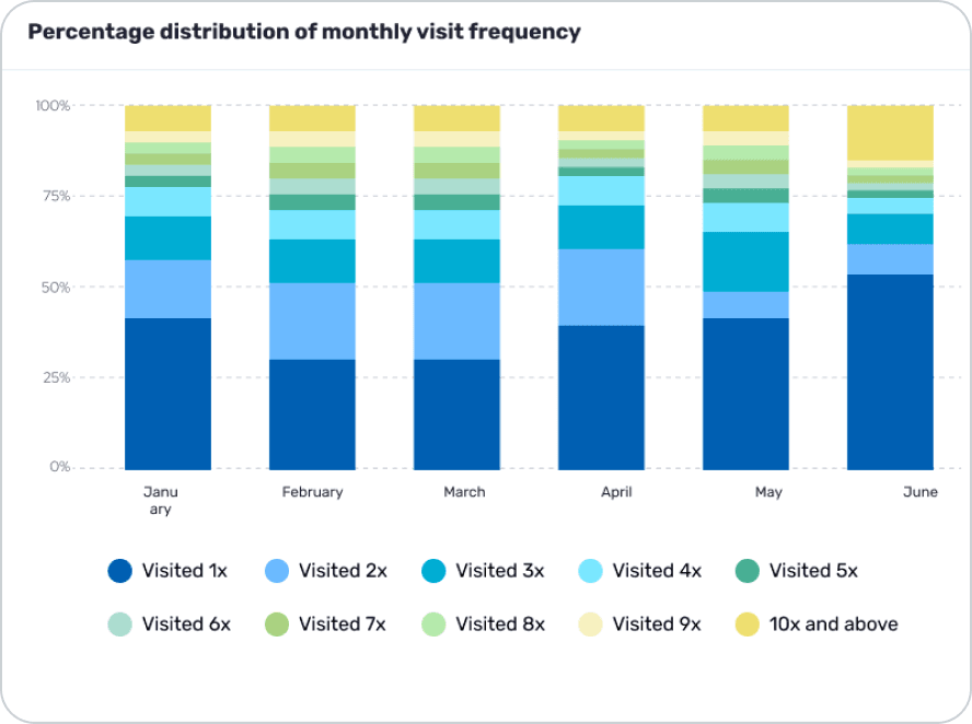
The chart has 10 visit groups, from 1x to 10x and above. There are not enough high-contrast colors for that many groups, and the data team’s usual high-contrast colors did not follow our brand.
We asked users: which differences matter to you?
The difference between 1x and 2x matters a lot. The difference between higher groups, like 4x and 5x, matters less.
So what did I do?
I used a dark and a light shade of the same hue, one after the other. Groups that sit next to each other are easy to tell apart, and the whole chart stays on brand.

I checked the chart with color-blindness simulations. In every case, the difference that matters most to users, 1x vs 2x, stays easy to see, because each pair changes lightness, not only hue.
Footfall Analysis shipped, and mall advertising managers used it for their reports.
Now · self-serve

Clients now create basic reports themselves, any time, without waiting for the data team.

Some clients asked for very complex charts that were not in the scope, so the data team still makes those by hand.
