01Introduction

Inquiro

Scaling a design system

I built Inquiro’s design system in Figma, from the smallest parts up (atomic design), so our design stays consistent and developers can reuse the same components instead of building new ones. I was the only designer.

  • Design system
  • Atomic design
  • Accessibility
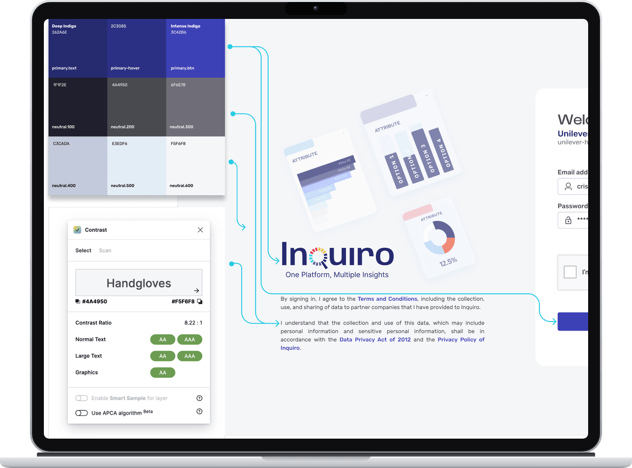
The Inquiro color palette and a contrast check on a laptop, with lines showing where each color is used on the sign-in page

Foundations

Before I built any component, I set the base: the principles we design by, our colors and our type. Every component uses these.

Our UX principles

  1. Present data clearly

  2. Listen to customers

  3. Prioritize accessibility and empathy

  4. Design intuitively

  5. Provide informative feedback

  6. Optimize platform performance

  7. Integrate Inquiro’s brand seamlessly

Color

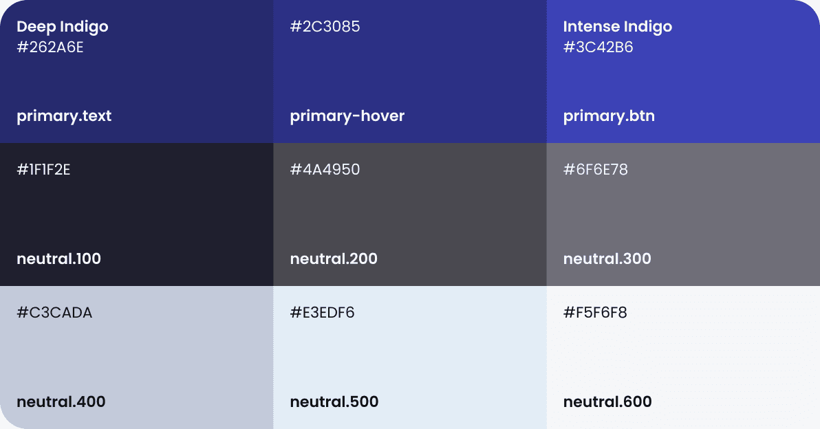
Blue Indigo is our primary color, to match our brand. Neutral colors are for text and other parts that are not about the brand. Each color has a name that says where it is used, like primary.btn or neutral.200.

Color grid. Primary: Deep Indigo #262A6E (primary.text), #2C3085 (primary-hover), Intense Indigo #3C42B6 (primary.btn). Neutral: #1F1F2E (neutral.100), #4A4950 (neutral.200), #6F6E78 (neutral.300), #C3CADA (neutral.400), #E3EDF6 (neutral.500), #F5F6F8 (neutral.600).
Primary and neutral colors, each with its name.
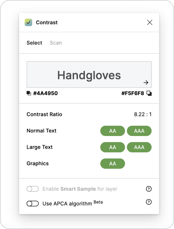
A contrast checker showing #4A4950 on #F5F6F8 with a ratio of 8.22:1, passing AA and AAA for normal and large text.
I checked text colors against WCAG. neutral.200 on neutral.600 is 8.22:1, which passes AA and AAA.

Typography

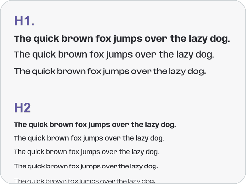
Each level, from H1 to caption, has set sizes and weights.

  1. Display

    Anybody, Clash Display

  2. Body

    Rubik

  3. Levels

    H1, H2, H3, H4, Paragraph, Caption

Type scale samples: H1 and H2 headings, each followed by the sentence 'The quick brown fox jumps over the lazy dog' in different weights.

Atomic design

Building components the atomic way

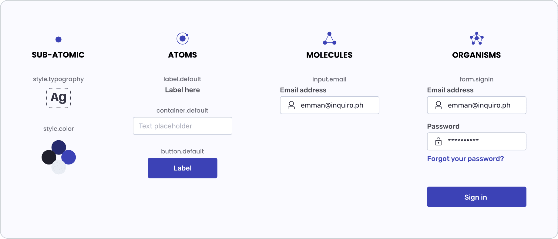
I built every component from smaller parts. Styles are the smallest parts. Atoms use styles, molecules use atoms, and organisms use molecules.

Atomic design levels. Sub-atomic: style.typography and style.color. Atoms: label.default, container.default and button.default. Molecules: input.email. Organisms: form.signin, a full sign-in form.
From styles to a full sign-in form.

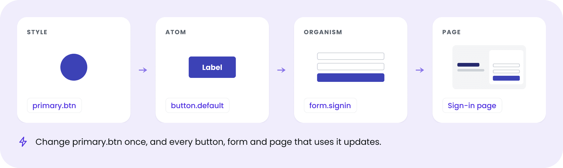
One change, updated everywhere

Because every level uses the one below it, a change at the bottom goes all the way up. The developers also built their coded design tokens based on my Figma styles, so design and code used the same colors and type.

A chain from style to page: the primary.btn style, the button.default atom, the form.signin organism, and the sign-in page. Change primary.btn once, and every button, form and page that uses it updates.

Components and states

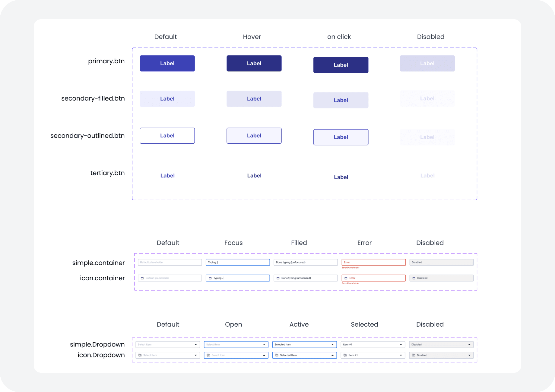
Each component has all its states in Figma. Buttons have default, hover, on click and disabled. Fields and dropdowns also have focus, filled and error. Developers could see every state, so they did not have to guess.

Component states. Primary, secondary filled, secondary outlined and tertiary buttons in default, hover, on click and disabled. Simple and icon fields in default, focus, filled, error and disabled. Simple and icon dropdowns in default, open, active, selected and disabled.
Buttons, fields and dropdowns with their states.

Outcome

The developers and I used the same components across our products.

  1. Design work

    Faster. I built new screens from existing components instead of starting from zero.

  2. Handoff

    Fewer questions from developers, because the components and their states were already defined.

  3. Consistency

    Screens across our products looked and worked the same.