01Introduction

A concept project

Making stock investing easy to start

Inveswift is a concept investing app I designed on my own in 2021. It lets Filipinos start investing with as little as ₱100, and it still has the tools that experienced investors need.

  • Concept project
  • Fintech
  • UX research
  • UX design
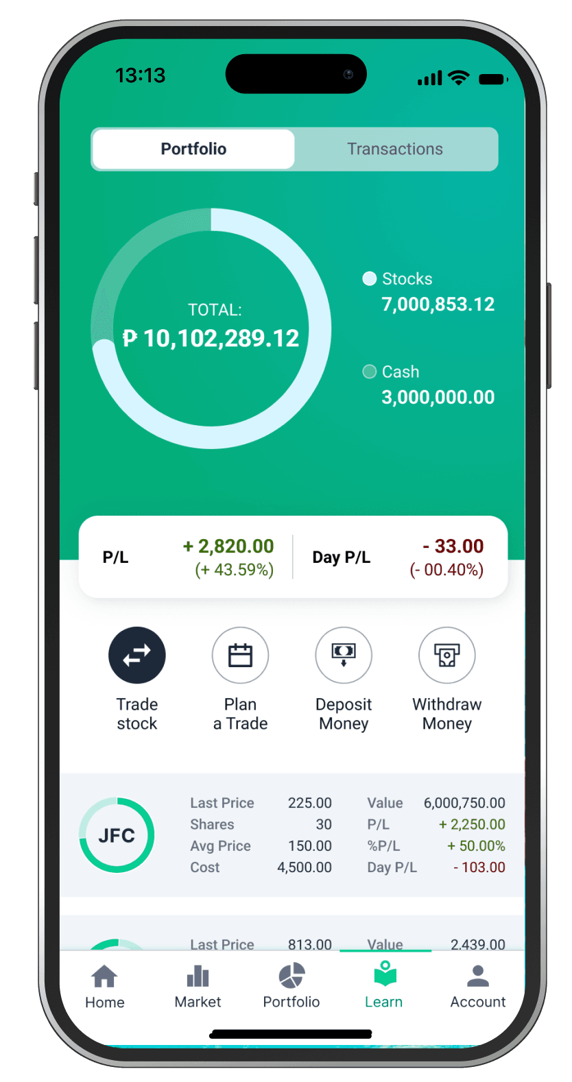
The Inveswift portfolio screen, with a total of ₱10,102,289.12 split into stocks and cash, profit and loss, and quick actions to trade, plan, deposit and withdraw

The problem

Many Filipinos want to grow their money in the stock market, but starting is hard. Budgets are small, apps are full of jargon, and people are afraid of losing money.

Experienced investors have the opposite problem: simple apps do not give them enough tools. I wanted to design one app that works for a first-time investor with ₱100, and still works for an active trader.

What stops beginners

  • Small budget

    Most brokers sell shares in board lots, so you cannot start with just ₱100.

  • Complex apps

    Charts, jargon and order types overwhelm first-time investors.

  • Fear of losing money

    Without guidance, the first trade feels like a gamble.
My process

I did this project alone, from research to testing.

  1. Interview 5 peopleNo experience to active traders
  2. Compare 3 appsGCash, First Metro Sec, Gotrade
  3. Create personasGil, Jessica and Migz
  4. Map the user flowFrom sign-up to first trade
  5. Sketch & wireframeLow-fidelity first
  6. Design & prototypeHigh-fidelity in Figma
  7. Test with 5 peopleRemote tasks and interviews

User research

I interviewed 5 people with different investing experience, from people who had never invested to active traders. I asked about their goals, what stopped them from investing, and which apps they used. From these interviews, I created three personas.

Personas

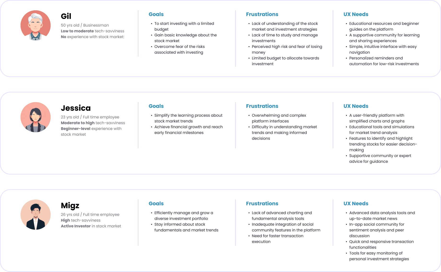
Gil has no experience, Jessica is a beginner, and Migz is an active investor. Each one needs something different from the same app.

Three personas. Gil, 50, a businessman with no stock market experience, wants to start with a small budget and is afraid of the risks. Jessica, 23, a full-time employee and beginner, finds investing apps overwhelming and wants simpler charts and guidance. Migz, 26, an active investor, wants advanced charts, market news, an in-app community and fast transactions.

Competitive analysis

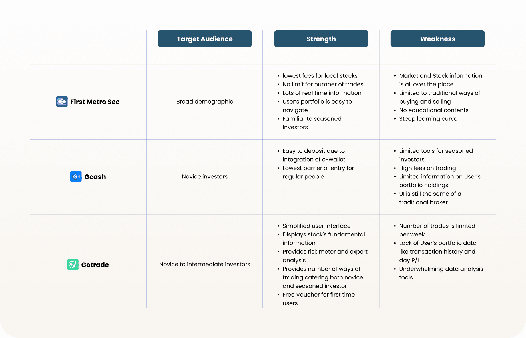
I compared the three apps my interviewees used. Each one serves one group well but leaves the other behind.

Comparison of three apps. First Metro Sec: broad demographic, low fees and lots of real-time information, but scattered information, no educational content and a steep learning curve. GCash: novice investors, easy deposits and a low barrier to entry, but limited tools, high trading fees and little portfolio information. Gotrade: novice to intermediate investors, a simple interface, risk meter and a free voucher for first-time users, but limited trades per week and weak data analysis tools.
Beginners needed fewer choices and more guidance. Active investors needed more tools. The biggest reason beginners did not start was fear of losing money.

Ideation

Before designing screens, I planned how a new user moves through the app, from sign-up to their first trade.

User flow

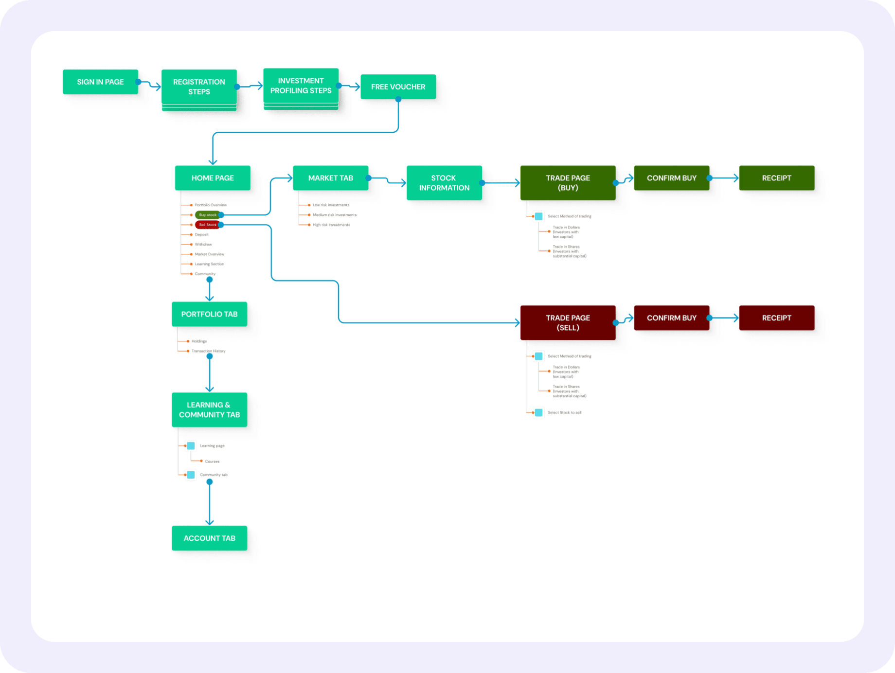
Investment profiling and the free voucher come right after registration, so every user has a profile before they see the home page. From the home page, buying and selling each take only a few steps to reach a receipt.

User flow from registration to investment profiling and the free voucher, then the home page. From the home page, buying and selling each lead in a few steps to a receipt.

Sketches & low-fidelity wireframes

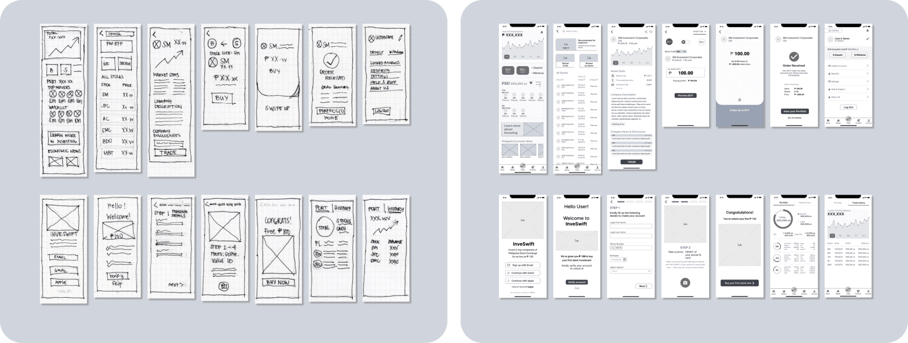
I sketched the main screens on paper first. Then I turned them into grey wireframes to check the layout and flow before adding color and real content.

Paper sketches of the main screens next to grey low-fidelity wireframes of the same screens.

Key design decisions

Each decision comes from the same problem: one app has to work for people with very different experience.

Know the user first

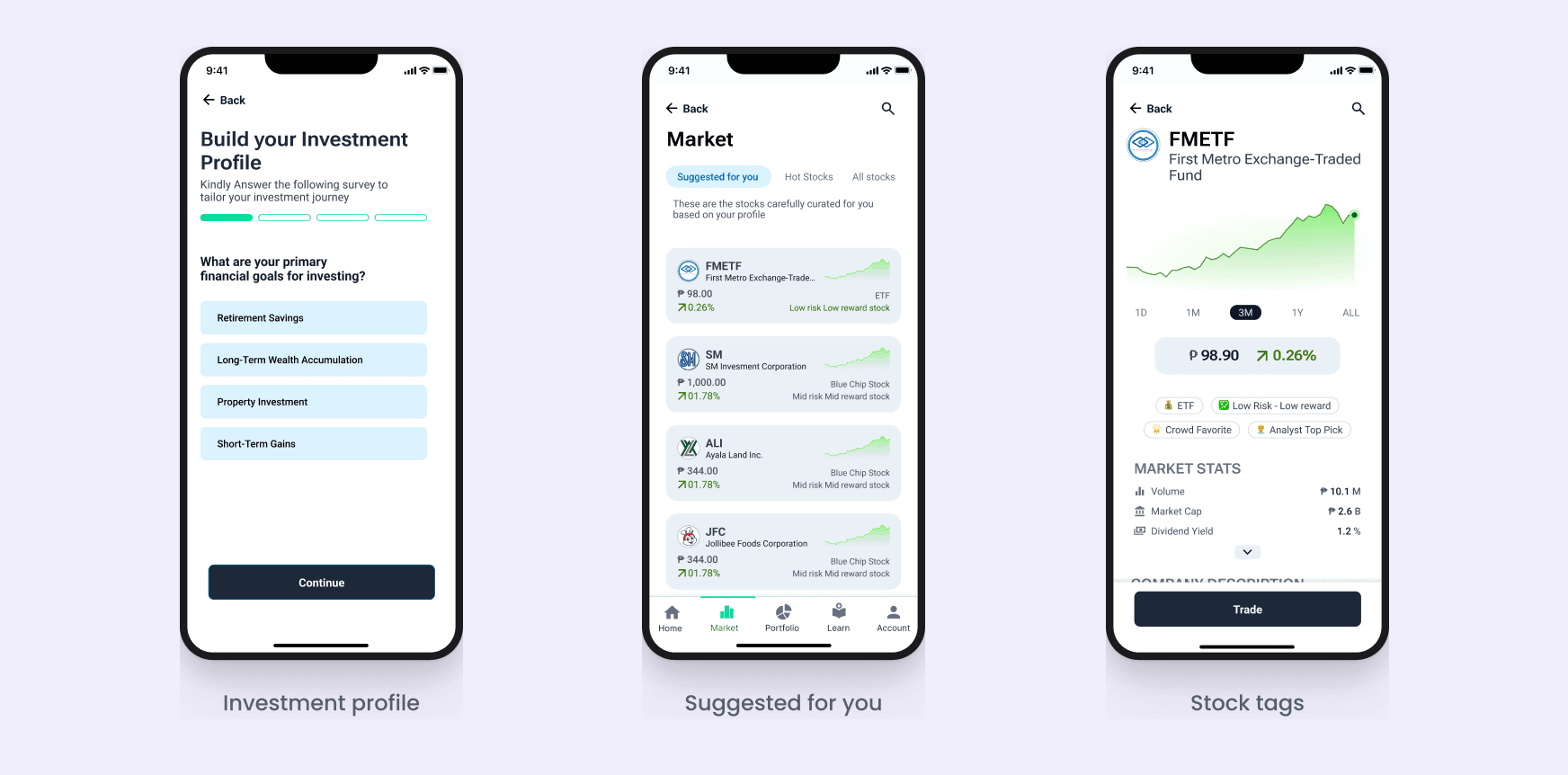
During sign-up, users answer a few questions about their goals and experience. This builds their investment profile. The market page then suggests stocks that fit their risk level. Beginners see ETFs and low-risk stocks first. Active investors see stocks with higher risk and reward. Tags on each stock, like “Low risk” or “Analyst top pick”, explain what kind of stock it is in simple words.

Sign-up to market

Three screens: the investment profile questions, stocks suggested for you, and stock tags like Low risk and Analyst top pick.

Buy with pesos, not shares

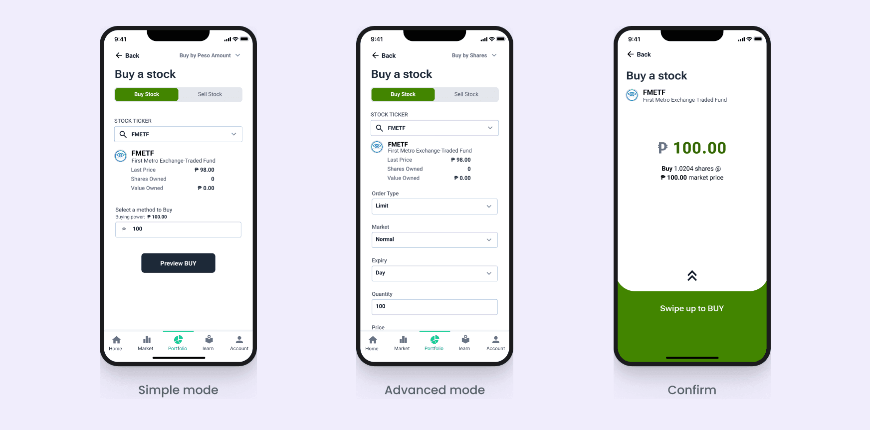
Buying a stock starts with one tap on Buy from the home screen. By default, users only pick a stock and type an amount in pesos, like ₱100. The app buys fractional shares for them. This part is a what-if, since Philippine stocks are sold in board lots. Experienced investors can change the buying method to “Buy by shares” to set the order type, market and expiry.

Buying a stock

Three screens: simple mode, where users type an amount in pesos; advanced mode, with order type, market and expiry; and the confirm screen.

Make the first trade feel safe

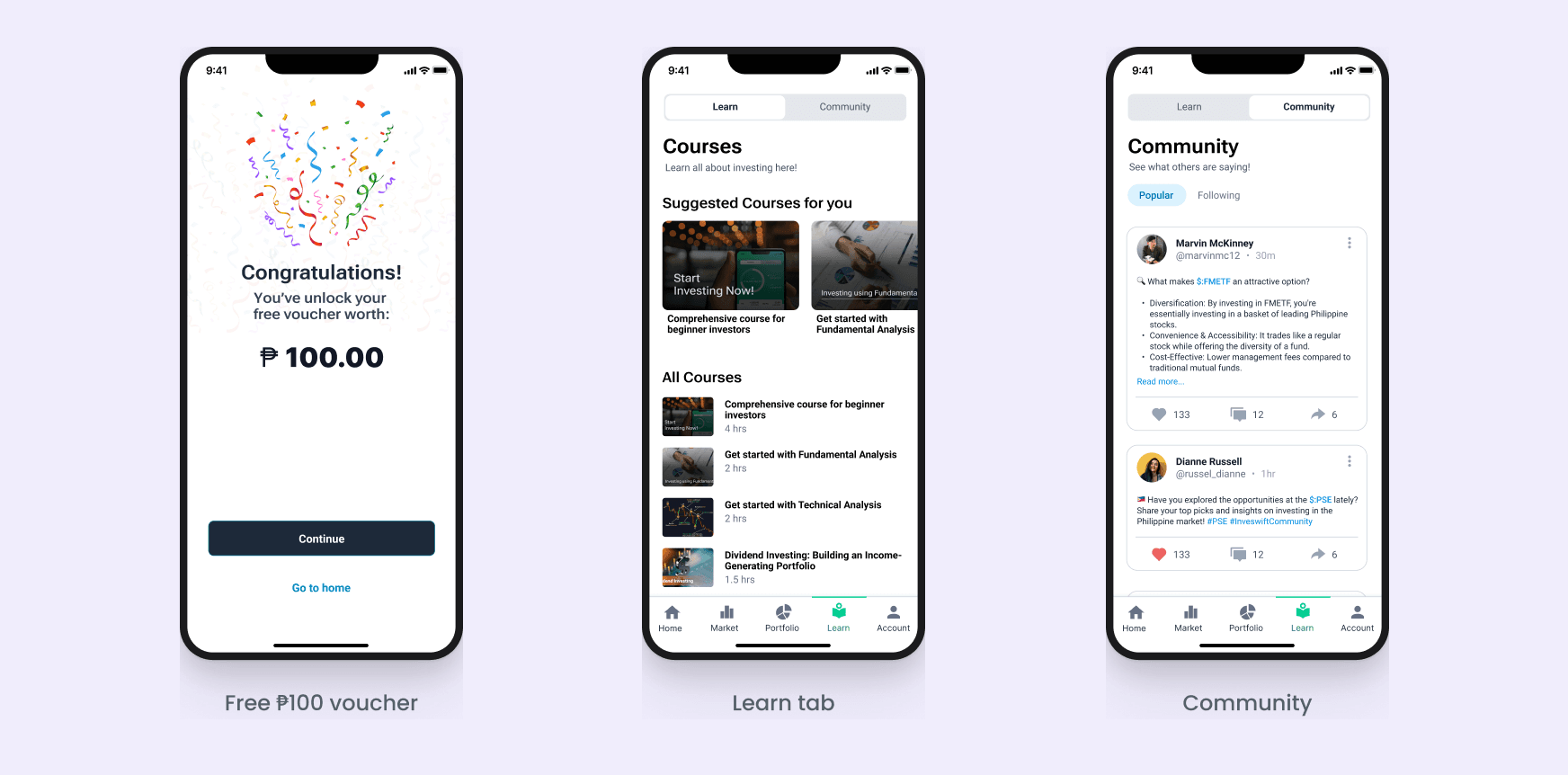
Fear of losing money was the biggest reason beginners did not start. I designed three things to help. New users get a free ₱100 voucher, so their first trade does not use their own money. The voucher idea came from Gotrade, which gives first-time users a free voucher. The Learn tab has short courses for each level, and the Community tab lets users ask other investors questions.

First-time investors

Three screens: the free ₱100 voucher, the Learn tab with courses for each level, and the Community tab.

Usability testing

I tested the Figma prototype remotely with 5 people, from no experience to active traders. Each person did a set of tasks, then I asked what they thought. Everyone finished every task. The biggest problem was stock terms that beginners did not understand.

Usability testing results: what happened and what I would change
CriterionWhat happenedWhat I would changeResult
OnboardingAll 5 finished sign-up and the profile questions with no problems.Nothing. Keep it as it is.Worked
Choosing a stockPeople felt confident picking a stock. Active investors wanted better charts.Add advanced charts in advanced mode. Make tags tappable to show similar stocks.Worked
Making a tradeAll 5 bought a stock, but beginners were not sure what the details under the amount meant.Explain each detail in plain words.Needs work
Stock termsThe design felt clean, but stock terms confused beginners.Add tooltips to stock terms. Rename “Portfolio” to “My Stocks”.Needs work
Learn tabBeginners wanted to use it like an FAQ.Add quick answers to common questions, and groups in Community.Needs work

What I learned

What worked

  • Hiding advanced options until someone needs them lets one app work for beginners and experts.
  • Asking about experience at sign-up made it possible to show each person the right stocks.
  • A ₱100 start and a free voucher gave beginners a safe first step.

What I missed

  • I focused on screens and flows, and did not test the words early.
  • A clean design does not help if users do not understand the terms.

What I would do differently now

I would:

  • Test the words and labels, not only the tasks.
  • Design a second version with the fixes from testing, and test it again.