01Introduction

EM+AA passion project
https://emarchitects.webflow.io/

A website showcasing my architectural projects

EM+Architects is a mock-up architecture firm. I made it to show my past architecture projects. I designed the brand and the website, and I built the whole site in Webflow.

  • Personal project
  • Web design
  • Branding
  • Webflow
Role
Designer and Webflow developer
Team
Just me
Year
2021
Platform
Responsive website
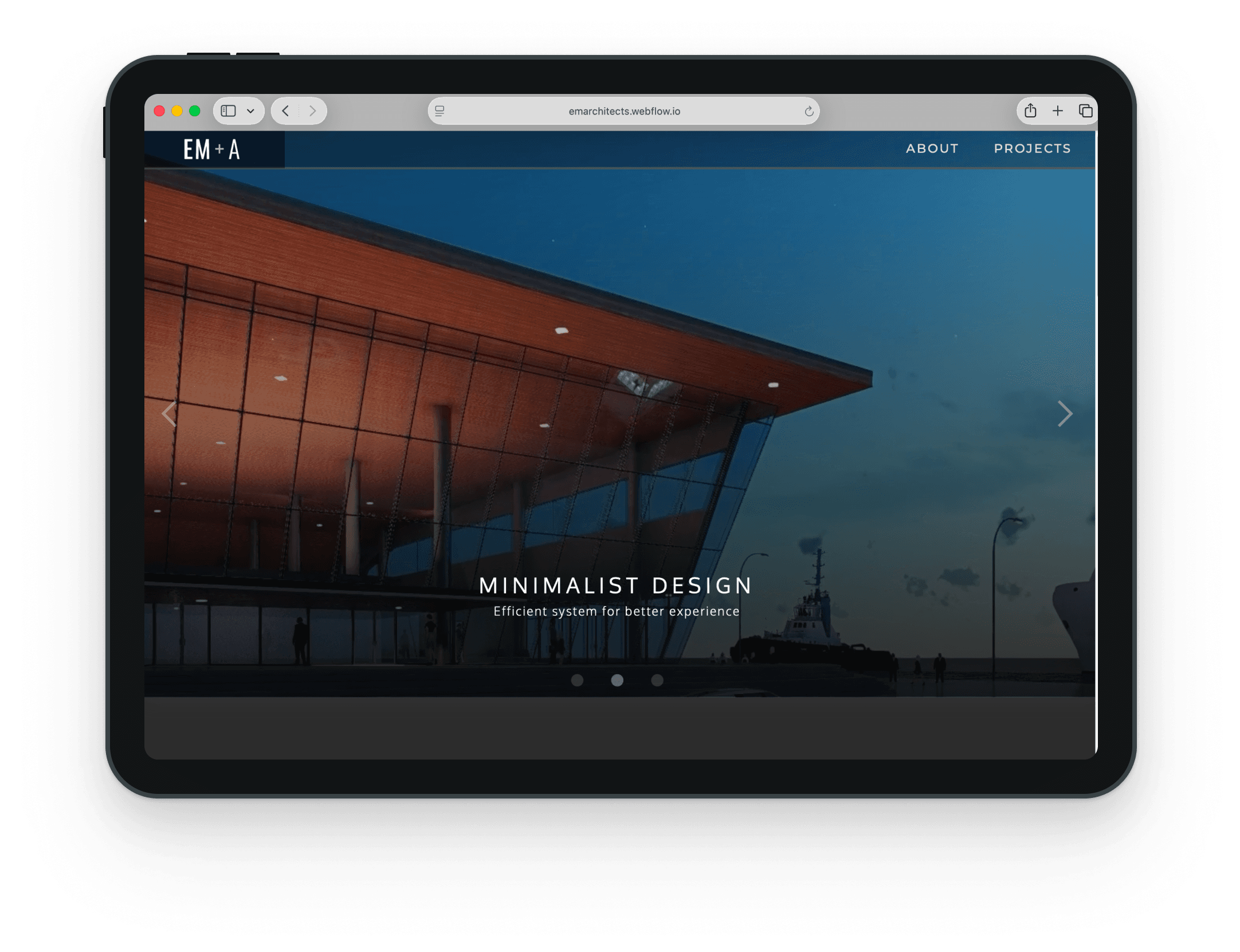
The EM+Architects home page on a tablet: the hero render of the Manila Ferry Terminal with the line "Minimalist design"

The project

The firm is not real, just a passion project based on my background in architecture.

Every building on the site is my own design, from back when I was still an architecture student. I drew the plans in AutoCAD, made the 3D models in Revit and SketchUp, and rendered them in Lumion. The brand needed to feel formal, elegant and high-end, the same as the quality of the buildings.

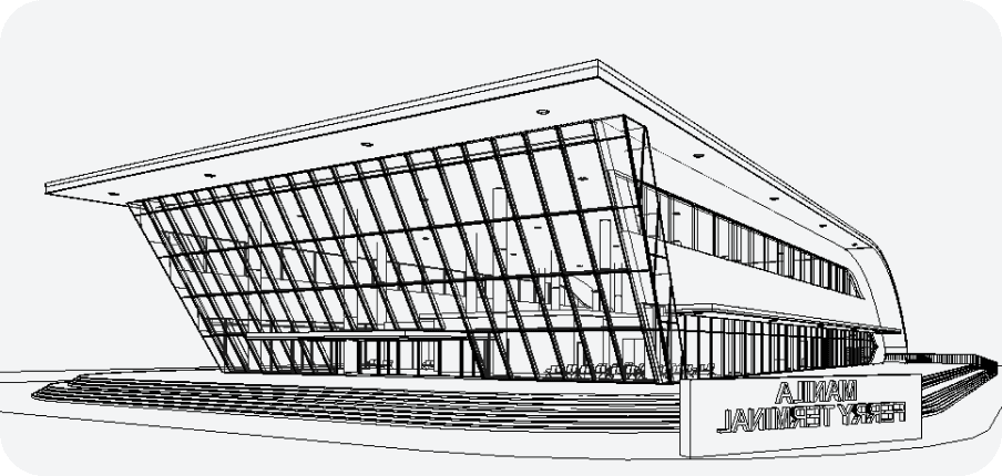
A black and white 3D model of the Manila Ferry Terminal.
3D model. Manila Ferry Terminal, one of the six projects.
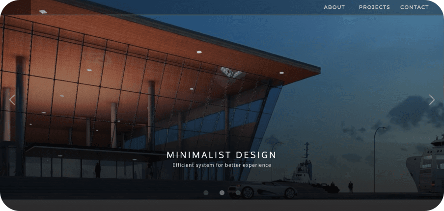
The final render of the Manila Ferry Terminal at dusk, used as the homepage hero with the words Minimalist Design.
Final render. The same building, used in the homepage hero.

Website

Figma
Wireframes
Webflow
Design and development, with the CMS for project pages

Architecture

AutoCAD
2D drafting
Revit
3D modeling
SketchUp
3D modeling
Lumion
Rendering

Sitemap

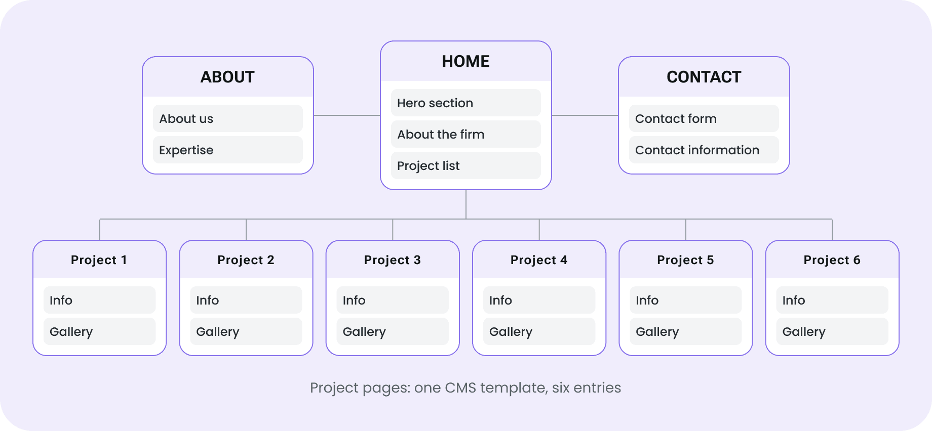
Sitemap. Home has a hero section, an about the firm section and a project list. About has About us and Expertise. Contact has a contact form and contact information. Six project pages, each with info and a gallery, all from one CMS template.

Sketches & low-fi wireframes

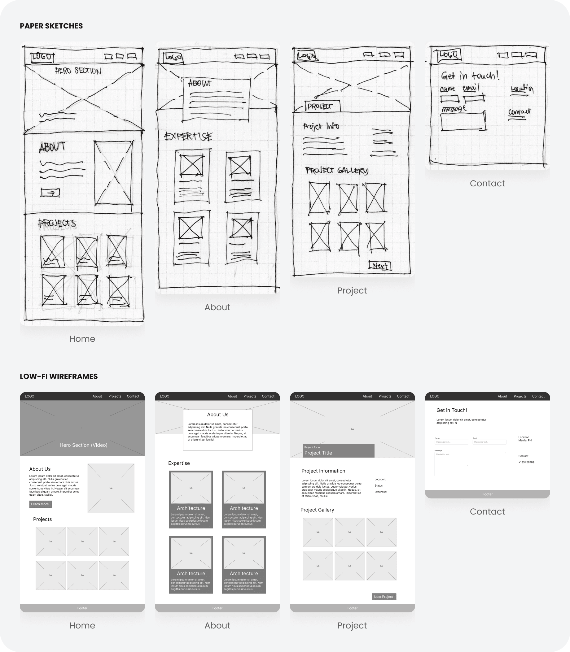
I started with quick sketches on paper for the four page types. Then I moved them to Figma as low-fi wireframes to fix the layout and spacing before building in Webflow.

Paper sketches and low-fi wireframes of the four page types: Home, About, Project and Contact.

UI design

Dark backgrounds, wide letter spacing in the headings and large renders give the site a formal, high-end feel. I kept the text small and quiet so the buildings are the main thing on every page.

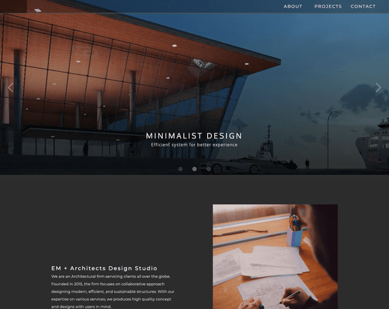
The top of the home page: the hero slider with a render, then the start of the studio intro with a photo.

Home page

A hero slider with three renders, a short intro of the studio, and all six projects.

  • Project cards use different heights, like a gallery wall
  • Each card shows the project name and type
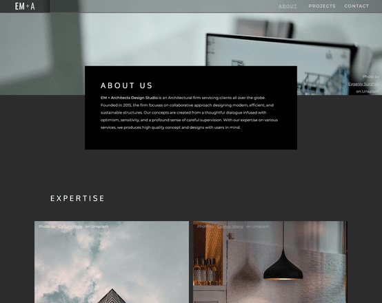
The top of the About page: an "About us" text box over a photo.

About page

The story of the firm, then its four services. Each service has a photo and a short description.

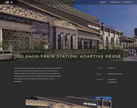
The top of the Old Paco Train Station project page: a large render with the project name, the story of the building, and the location, status and expertise on the right.

Project page

A large render with the project name, then the story of the building and a gallery.

  • Location, status and expertise sit on the right
  • The gallery mixes renders and floor plans
  • Previous and next links at the bottom

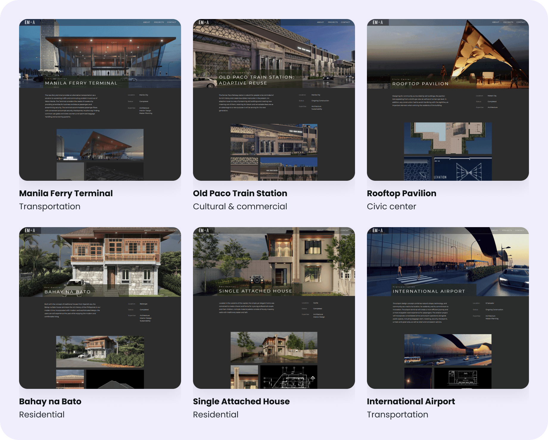
One template, six projects

I designed the project page once in Webflow and connected it to the CMS. All six pages come from the same template.

Six project pages from the same template: Manila Ferry Terminal (transportation), Old Paco Train Station (cultural and commercial), Rooftop Pavilion (civic center), Bahay na Bato (residential), Single Attached House (residential) and International Airport (transportation).

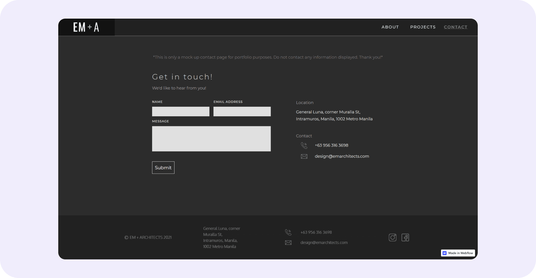
Contact page

A simple form with the office address and contact details beside it. A note on top says it is a mock-up page, so no one sends real messages.

The Contact page: a note that it is a mock-up page, a form with name, email address and message, and the office location and contact details beside it.

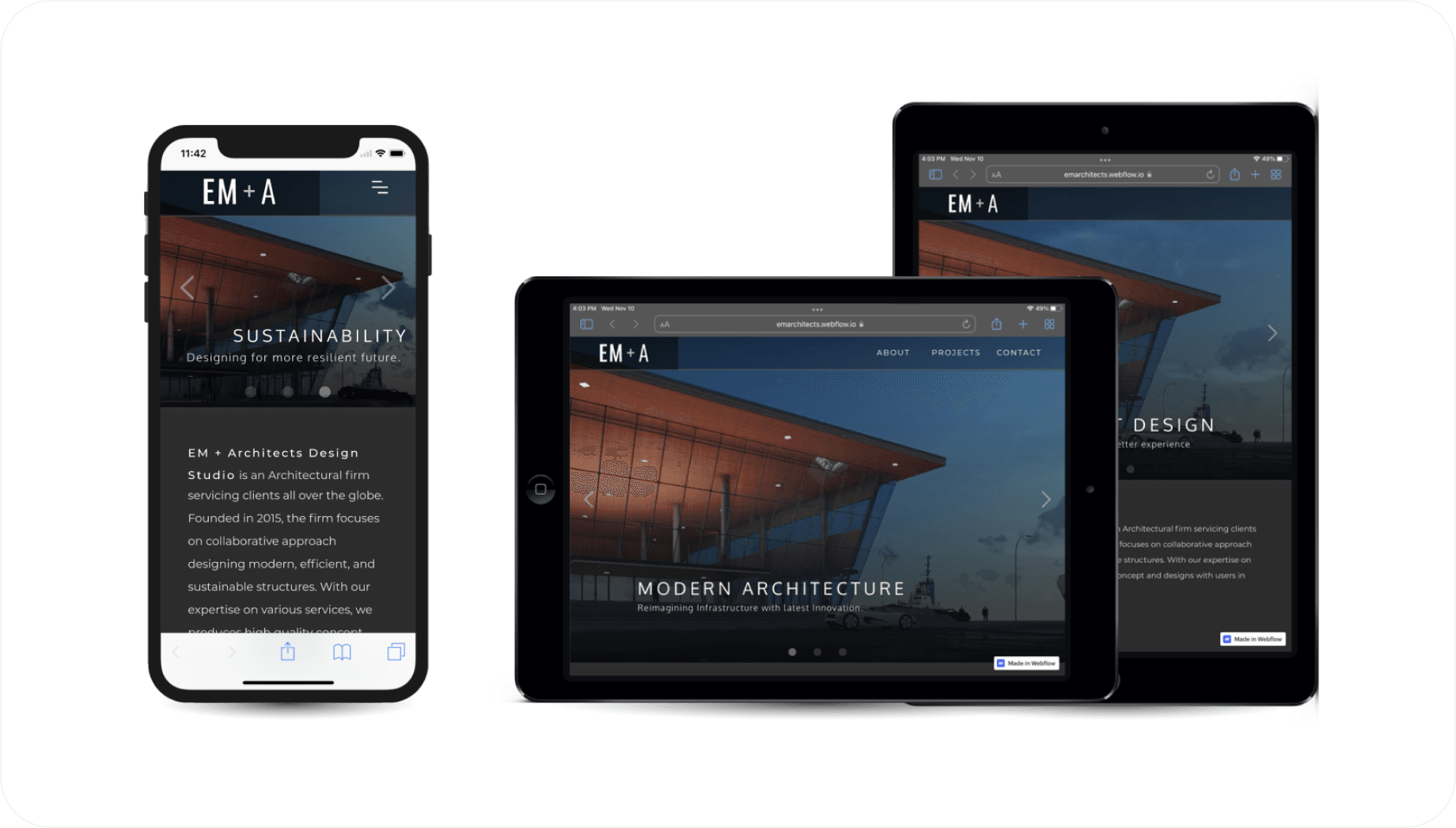
Responsive design

The site works on desktop, tablet and phone. On phones, the menu turns into a hamburger and the content stacks in one column.

The site on a phone and two tablets, with the menu as a hamburger on the phone and the content in one column.